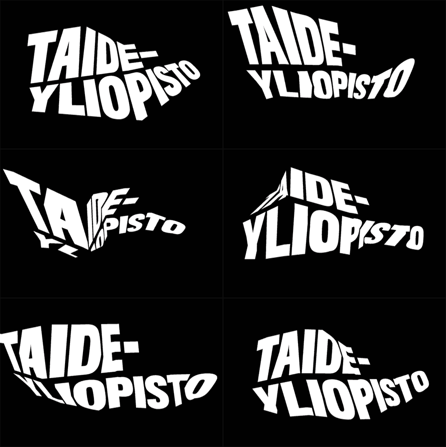
Set to open in early 2013 the University of the Arts Helsinki ("Taideyliopisto" in Finnish) is the new organizational name for the merger of three existing universities: the Finnish Academy of Fine Arts, the Sibelius Academy (music) and the Theatre Academy Helsinki. The first two were established in the mid to late 1800s while the latter in 1979, and together they have around 2,000 enrolled students. The new name was accepted in January and this week they introduced their identity, designed by Helsinki-based Bond.

Previous logos for the three institutions.

Brand assets.
[Google-translated, as my Finnish is not as good as it used to be when never.]
University of the Arts is a common sign of a reduced, feel free to X. At the same text with custom designed logos to complete the look. Sign is ambiguous, such as art. Signal can be seen, for example the starting point and destination, meeting place, location, Signatures, an unknown force, a warning, issue and solution.
Art is the nature of the University. We want to be Finland's most attractive university and an active social actor. Our new look describes these things
The reduced expression leaves room for art and each college's own profile for the construction, says the rector of the Academy of Fine Markus Konttinen.
— Press release


The new logo in English and Finnish.

The new logo on seizure.

The logos for each institution. Small above, large below.

The previous logos were all conservative, dignified, and signified "higher education". These new logos, for the main university and its three ducklings, are a bunch of rebellious hooligans out to prove their parents wrong about why they shouldn't have become lawyers or doctors. It's not an easy set of logos to digest but they are great. They are full of energy and attitude. The execution is pretty "good". It's actually really hard to pull off this kind of deconstruction in a convincing way and here they've done it for three different names in two different languages. The "X" feels (rather contradicting) both gratuitous, as it doesn't visually match the typography, and necessary, as it serves as an anchor of recognition amongst the three universities. I do like the idea of "X" as a central point for arts converging but it seems like it needs better integration with the identity. We talk a lot about art and design universities not feeling very creative when they redesign. Well, folks, this is it. This is an art and design university being as creative and bombastic and adventurous and weird as it gets. The result is divisive: you either hate it or you love it. Either way, it beats playing it safe.

T-shirt image via The Branding Source. I keep wanting to click that "X" to close it.

Thanks to Marjo Loponen for the tip.

Don't forget to cast your vote about this post online
