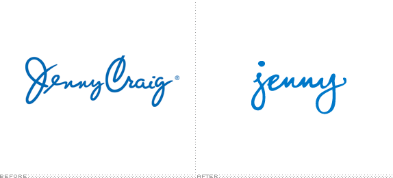
Established in 1983 by Jenny Craig (and husband Sidney Craig) in Melbourne, Australia, Jenny Craig is a weight loss and nutrition company that offers at-home diet programs as well as "In-centre" at over 650 locations worldwide. Last year, Consumer Reports named it the number one diet. This past November, Jenny Craig lost some of its own weight, shedding the "Craig" to just be known as Jenny, along with a new logo and brand ambassador.
![]()
No longer referred to as Jenny Craig, people everywhere will get to know Jenny on a first name basis. With a perky, fun attitude and an easy, refreshing approach to physical activity and weight loss, the new Jenny is sure to be unlike anything anyone's seen before.
— Press Release
Jenny's new brand ambassador. Wait for it… wait for it…
The old logo was one of the nicer feminine, script, signature-y logos out there. Smooth, bold, elegant, and, one would assume, the founder's own signature. The new logo, still feminine, still script-ey, and still signature-y is almost the antithesis of its predecessor. Neither smooth, nor elegant it now looks like a chick that left her name and phone number on a bar napkin with only a red lipstick kiss at the bottom missing. Sure, it might feel more "everywoman" and earthy but it looks too unfinished and too amateurish to represent such a large brand. The secondary icon with the "j" on its own is borderline ridiculous in that hexagon shape. At least they have Mariah going for them.
Thanks to Cameron Sandage for the tip.

Don't forget to cast your vote about this post online
