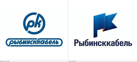
Established in 1949 in the city of Rybinsk in Russia, Rybinskkabel is one of the country's leading producers of cable with 2,500 employees and more than 16,000 kinds of cable and wires with copper and aluminum conductors. With its origins in Soviet Union-era Russia and current new management it was time to bring Rybinskkabel into the twenty-first century with the help of a new identity designed by Moscow-based Nile.


The icon is a stylized version of a PK acronym — the "P" sounding as "R" for Rybinsk in Cyrillic — in the shape of a flag and with the flair of a lightning bolt to signify the energy industry. The flag also represents the company's values: high goals and achieving them, quality, responsibility, and leadership.

The stencil typography is a nod to that used extensively in their product labeling.

A tight crop of the flag icon is used as a visual element, large across different applications.

As antiquated as the old logo looked it did manage to convey the company's product, representing a thick cable seen head on. The new logo is much more generic as to what the company does, but having the "cable" (kabel) in its name pretty much sums it up and I really like the concept of fusing a PK acronym into the shape of a flag — it's subtle and, more importantly, the result is energetic and optimistic. I'm usually not one to fall for shadings and gradients but there is something in the way this icon is rendered that I really like, and it wasn't explained but I see the orange backing of the flag as the copper filling of a cable. The typography use is more effective in application with the stencil and geometric format than in the more Humanist wordmark on the logo. In application, the crop of the flag looks great, adding a strong visual element to each piece and the simple orange and dark blue color palette holds well across the board. Overall, a great improvement.


Don't forget to cast your vote about this post online
