Owned by Pearson Australia Group after it purchased the Australian Borders and Angus & Robertson online businesses in 2011, Bookworld is an online book, music, and video retailer with over half a million existing customers and a focus on Australian authors and artists. It also has a very clear target of beating Amazon by offering lower prices and free delivery. Earlier this Fall, Bookworld introduced a new identity designed by Interbrand Australia.
Interbrand Creative Director Mike Rigby explains "our solution was born from asking ourselves a very simple question: have you ever wondered where the characters go when you close the book? The answer is, they go to Bookworld — where books come from."
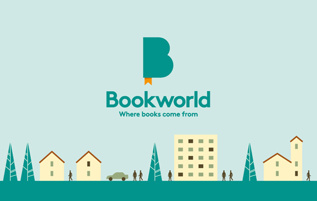
This thought led to the literal creation of a "Bookworld" — a magical place where every book in the history of literature comes from. The fun, engaging and entertaining brand plays out across a series of illustrated, genre specific landscapes. From Crime City, to Horror-Ville and everything in between. Bookworld is also a place that's full of characters. And many famous personalities and archetypes populate the communications. From Sherlock Holmes, to Frankenstein.
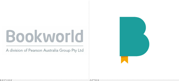
The new logotype features a simple and bold "B" that is reminiscent of a book with the subtle "W" designed to look like a Bookmark. The logo is also designed to open up in animation — much like a book — revealing the magical world within.
— Interbrand case study

Introduction to the world within Bookworld.


Some of the genres within Bookworld.

Promotional characters.
The old logo was fine, but it was as exciting as that of a law firm's and with such a great, simple name it was a real shame it had gone unexplored. The new logo solves both issues — no more boring logo and exploding the notion of a book world. The logo is such a simple and clever idea: not so much the "B" that passes as a book but the bookmark that poses as a "W". That's the detail that makes the logo work. Then adding the animation element where the "B" flips open to reveal the humorous worlds within it brings it so well to life, not to mention the pop sound the bookmark makes when the "B" closes back up. Beyond the logo and into the Christmas campaign (below) the identity starts to border on appearing as a children's book publisher, but the upscale typography, clever writing, and backstabbing politicians in the animation help bring it back to adulthood. As the brand evolves it would be good to give it a bit more of an edge to avoid an overly friendly feel. Nonetheless, it's a fun identity that should help get it some attention and fight those Amazonians.

Website.

Banner ads.

Gift voucher.

Packaging.

Office graphics.
Christmas advertising campaign for TV, print, online and outdoor; above and below.


Don't forget to cast your vote about this post online
