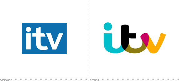
Established in 1955, ITV (originally for Independent Television Authority) is the biggest commercial television network in the UK and is the main competition of the BBC and Channel 4. ITV operates five different channels: ITV1, ITV2, ITV3, ITV4, and CITV covering everything from reality TV to sports to drama to sitcoms to children programming. Last week, at its upfronts event, ITV unveiled a new umbrella logo for its company and all its channels to be rolled out on January 2013 along with supporting new on-air packaging for all channels. The design has been done in-house. For the most comprehensive coverage and reporting about all the changes, please see this Digital Spy story.

Current logos for all channels and properties. All to receive a makeover on January 2013
The new logo forms the basis of all ITV's branding domestically and internationally, and is a warm, bold design based on a formalised version of human handwriting, comprising of five colours, in its static state.
When the logo appears on coloured background, such as marketing images for ITV programmes - it will adapt and change according to the background colour scheme of the image. This colour picking technique means that the logo can be dynamic, shifting tone along with the content, reflecting and blending with the mood of different shows.
Within the ITV broadcast business, the family of UK channels will all have a new on-air look, with ITV2, ITV3, ITV4, and CiTV receiving new colour schemes, clearer brand propositions, and accompanying updated brand identities.
— Press Release


A few of the possible color combinations, adapting to each show.

Not being familiar with ITV, the moment I saw the original logo I assumed it was a news channel of some kind with drab programming. Far too corporate for a network showing The X Factor or Downtown Abbey. The new logo supports the network's commitment to being at the "heart of popular culture" with a far friendlier, bubblier, happier logo. Reactions online have been mostly negative — surprise, surprise — but the new logo has a nice, unexpected bounce to it and even if it's not to everyone's liking it is very properly executed. Notice the notch under the cross stroke of the "t": it ensures that when the logo is made smaller, that area doesn't look like a blob. The counter spaces between all the letters are also quite well done, considering how disparate the three letters are. The main color configuration shown is a little unfortunate — it's just ugly, sorry — but obviously with the promise of a color-changing logo that can be easily fixed and the resulting overlays will be more pleasant. Overall, the logo feels far more appropriate than its predecessor and seems to have potential for expanding into the rest of network. I presume we will do a follow-up in January once this logo is applied across all channels, so stay tuned.

Images from the upfronts event, above and below.


Thanks to Alex Edwards for first tip.

Don't forget to cast your vote about this post online
