
Established in 1868, the University of California (UC) is the public university system of the state of California that encompasses nine campuses: Berkeley, Davis, Irvine, Los Angeles, Merced, Riverside, San Diego, Santa Barbara, and Santa Cruz. Rarely will people say they attend or teach (past or present) at "UC" or "University of California", they are usually very specific as to which campus — its most well known probably being Berkeley and UCLA — so UC and University of California are more of a parent company. UC "includes more than 220,000 students and more than 170,000 faculty and staff, with more than 1.5 million alumni living and working around the world." So, it's big. Starting in September, UC introduced a new logo and identity. No design credit given. And no specifications shared as to how, or if at all, this logo affects the unique logos of each of the nine campuses. Currently, the identity has been rolled out in an admissions website separate from the main site, a campaign website for an initiative called Onward California, and on another (see Stanford) very nice brand mini site.
New logo introduction. Quite well done and does a great job in explaining where everything comes from.


The previous wordmark reflected the kind of secondary role University of California played in contrast to its individual campuses, all of which have strong academic and athletics identities. Basically, the previous wordmark could have not even existed and no one would have complained. With this new identity, it's clear that UC wants to stand out more and establish itself as the guardian of all these campuses and it's a great move. The icon is simple and memorable; perhaps hard to read as "UC" because the "C" is so prominent and the "U" reads first as a book/shield than a "U" but emphasizing C for California is not such a bad thing. Some of our tipsters suggested it doesn't look very collegiate and I think that's fine as this is more about establishing a friendly brand presence for the overall family of campuses while each campus then can drill the collegiate message more efficiently. The wordmark is set in FF Kievit, which starts to look a little too default-y or Microsoft-y but it's certainly a safe and honest choice.


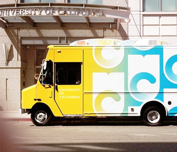
In application, the logo can be pattern-repeated or is accompanied by a lot of angled lines, which start to feel "Boldly Californian" as described in the Vimeo page of the video at the top. The Boldly Californian vibe is best evidenced in the Onward California— it really looks as the child of the 1980s/New Wave/California Michaels look. Lastly, there is also a revised seal that maintains the overall wobbliness of the original but with cleaned up details like less text on the book, less tangled ribbon, and better spaced dots on the outer ring. I wish they had hand-crafted the typography there too and not just put Copperplate Gothic on a circle (or on the ribbon, my God!). Overall, this is a really great redesign that gives UC its own personality.


Thanks to Justin Gaspar for first tip.

Don't forget to cast your vote about this post online
