Paul Bailey of 1977 Design got in touch to contribute this redesign for CHR Travel. The remainder of the post is from 1977 Design.

CHR Travel is a very successful travel company with a global client base of tour operators, with whom they create memorable tours of Europe for the tour operators’ customers. However, their visual brand did not reflect either their core offering, their people-focused approach or their strong reputation in the market.
In early strategy discussions with CHR Travel it became clear that they had a few issues with their brand. Firstly, it was unclear that their offer included Europe and not just the UK. Secondly, there was confusion with potential clients as to whether they were a travel company (flights, etc) rather than a tours provider. Finally, their focus is on building great tours which the tour operators’ customers will always remember, and this needed to show through.
In response to these issues discovered in the strategy discussions our approach to the rebrand is explained below:
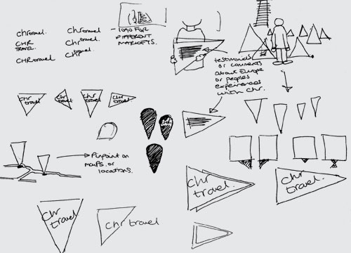
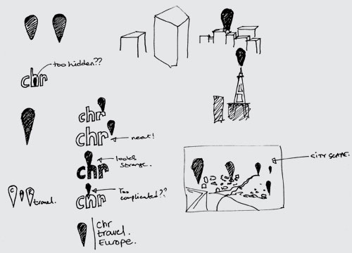
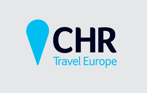
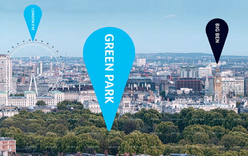
Use of a locator graphic device (pin) within the brand identity to give a clear indication of the core offer of CHR Travel, that of organising tours of destinations. With a global audience, and multiple languages, a simple, graphic symbol device was appropriate
- A reworking of the company name, which is commonly referred to in their industry as CHR, gave both prominence to CHR and included reference to Europe. This led to the creation of an explanatory tagline in ‘Travel Europe’
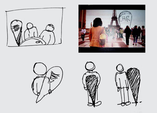
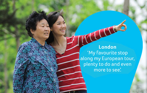
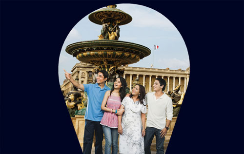
- The prime focus of the tours is that people enjoy seeing the sites of Europe, and so the imagery used focuses on groups of people in key European locations
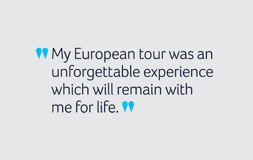
- Personal testimonials are highly regarded in the key client territories of China and India, and so the pin device from the identity is used as a stylised speech mark for quotes from previous tourists
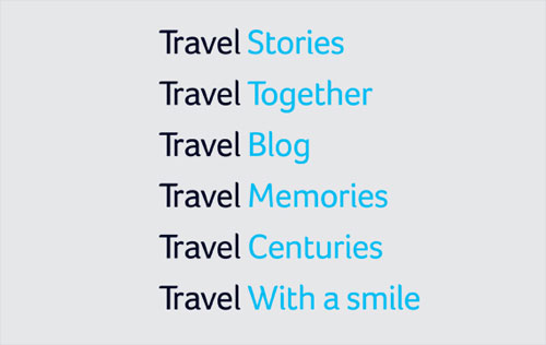
- The Travel Europe line is mimicked in a title style for CHR which is used to reflect the company approach and personality, e.g. Travel with a smile, Travel stories, Travel together, etc
Our aim in this rebrand was firstly to clarify CHR’s brand and then use design to explain some key elements of their brand offer and personality. From our brand strategy discussions we learnt that the company’s offer and personality was already strong, current clients know how good the company is, but it just wasn’t being reflected in the design. We are sure that this new brand approach will share this knowledge with new clients across the world.

Old CHR Travel logo (above)
—
View more work from the London studio on the 1977 Design website.
