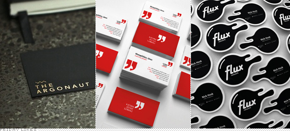
This week we celebrate the fake, the conceptual, the unclientedness of designing for the sake of designing. All three Likes today are concept works by designers who enjoy what they do. While on the subject: I vote for Behance users to CLEARLY mark their work as concept if it is. Don't try to pass your work as real if it isn't. (A) it's disingenuous and (B) there is no shame in it. Celebrate that you took initiative to create something that you feel is right and the way things should be done. It lets clients know that if they trust you and work with you they can get something as cool and dynamic as this unfettered approach. So, please, if it's concept, disclaim it.
The Argonaut Hotel

Designed in three days by Vancouver, BC-based Dawson Beggs this concept identity for an upscale hotel in San Francisco is inspired by the Gold Rush and shaped like "the sails of a ship and the Golden Gate bridge." The logo has that special hipster quality that would go perfectly on a boutique hotel. But more than anything, I'm impressed with the commitment to reproducing the concept using (what I'm guessing is) gold rubdowns (or transfers). That's method designing, man. [More].

Katona József Theatre

This identity by Hungary, Budapest-based Botond Vörös is really convincing and I'm 99.99% convinced it's concept and not real — that 0.01% of doubt is because it is so well thought out. The mock-up images, as well done as they are, do reveal its Photoshoping. Nonetheless, a clever logo concept, executed very nicely and convincingly. [More]

Flux

Totally faked by Atlanta, GA-based Craig Pinto this identity for a TV network had me going for a while when he sent it to me to see. I was trying to find this Flux channel on the internets. If you go to the More link you'll see that there is a stupid — the kind of stupid I like— amount of work, from motion style frames to guidelines to tchotchkes to on-air graphics, that make it really hard to believe that anyone would do this just for fun. But fun it is and it looks great. [More]

Don't forget to cast your vote about this post online
