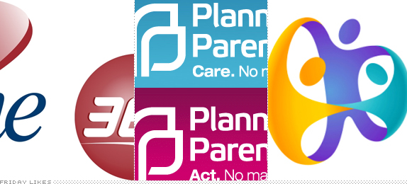
This week I might be poisoning the Friday Likes well, but too many wrecks piled up together that I thought it would be worthy to do Friday Likes bizarro world with some really hideous work. Enjoy. Or not.
Capital One 360

As if Capital One didn't already have one of the worst logos in circulation they have doubled down on both the amount of swooshes and amount of suck with the takeover of ING Direct, a popular online banking service, which was acquired by Capital One in February and has just renamed it Capital One 360. (Please visit the new site so that you can "paint" the new logo). We extend our sincerest condolences to those and their family who now bank with this tragedy. [NYTimes Story].

Planned Parenthood

For some reason the Planned Parenthood logo has always — or at least since 2004 — reminded me of the Dharma Initiative logo. For the kind of support PP offers their logo has been remarkably unwelcoming. The only good thing it had going for it — in that 1960s strict corporate identity kind of way — was the two "P"s coming together as one. Now, someone decided that they needed to be unpacked and made more literal as two "P"s, except that now it looks like a real estate logo with buildings stacked against each other. Plus, the wordmark: ugh. And some senseless Helvetica thrown in into the new tagline, for good measure. Someone needs to protest this logo with the same (right or wrong) passion with which people protest Planned Parenthood. [Press Release (sort of)]

Rio 2016 Rip-offs

The 2016 Rio for the next Summer Olympics has a lot of good things going for it: friendliness, worldliness, unity, etc. All things that make for a great logo story. So it's no surprise that everyone wants a piece of it, if not all of it. The first is a logo for the State Health Improvement Plan by the Connecticut Department of Public Health, who have some watered down version of the same concept. The second, and more ludicrous one, comes from the government of the city of Huatabampo in Mexico, who not only claim they had never seen the Rio 2016 logo but that they actually had the idea first; the designer says, and I quote (and translate), "In fact, I had already thought of this logo many years ago, it's only that I had not created it, so in any case, they stole the idea from me." Bunch of dumbasses all of them, from Connecticut to Mexico. [State Health Improvement Plan / Huatabampo Story (Spanish)]
Update (9:33 am): Despite my ability to read Spanish I did not realize the story linked for the Huatabampo logo is the equivalent of a The Onion article. So, the logo rip-off is true, but the story and quotes are satire. Apologies. And thanks to L8 in the comments for pointing it out.

Don't forget to cast your vote about this post online
