Image may be NSFW.
Clik here to view.
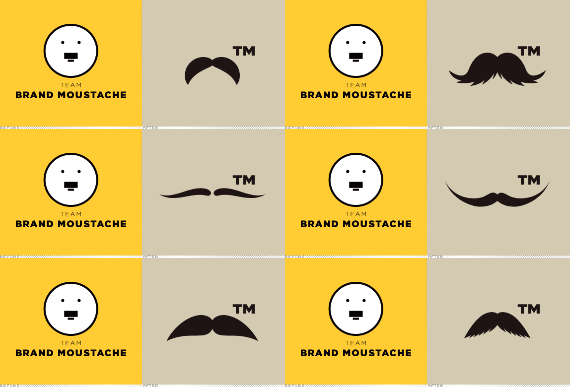
Established last Friday, November 2, 2012, team Brand Moustache is an initiative launched by Armin Vit to mobilize the male audience of Brand New to grow facial hair between their upper lips and noses to benefit Movember, the worldwide movement to generate awareness and raise funds to support prostate cancer and testicular cancer initiatives. On a whim, Armin decided to join Movember and lead a team of willing participants as captain of team Brand Moustache, for which he designed a logo that, upon unveiling, ignited controversy among the very readers he was trying to rally: the logo, various of them claimed, looked like Hitler and his iconic rectangle moustache. Armin is Jewish. Armin hates Hitler. Upset, Armin denied the claim and proceeded to call said readers doofuses — then removed the Hitler moustache in exchange for a more walrus-y one and, in a hissy fit, declared he might as well just be designing for "the lowest common denominator." The PR department of UnderConsideration LLC convened with its C-level executives and after circulating a memo around the office decided the best thing would be to signal change by redesigning team Brand Moustache's logo. Today, team Brand Moustache unveils its new, flexible identity designed by Austin, TX-based Armin.
Image may be NSFW.
Clik here to view.
The new logo reflects the many kind of moustaches one might find on different men, making it ideal for a team with different men, all growing moustaches. The moustache is such a distinctive feature that it deserves to be its own brand: our logo is all the moustaches in the world — trademarked. There is no "I" in "Team" but there sure is a ™. The logo provides a flexible identity that allows any moustache to become part of the brand but when used with approved graphic moustaches it can brand itself unto anything. Even Hitler. No. Except Hitler.
— Press release
Image may be NSFW.
Clik here to view.
Design industry moustachioed heroes. We salute them with a ™ on their epic moustaches. Top to bottom, left to right: Saul Bass, Walter Landor, James Victore, Geoff McFetridge, and Matteo Bologna (photo by Catalina Kulczar-Marin from the 2011 Type Directors Club judging).
Image may be NSFW.
Clik here to view.
Brand moustache brand TAKEOVER, bitches!
The old logo was perhaps too close for comfort. Jackass Nazis had to give everything a bad name didn't they? Swastika? Previously a nice symbol in other cultures: Evil. The rectangle moustache? Hilarious on Charlie Chaplin or Groucho Marx: Evil. Although the proportion of the mouth and the small eyes indicated that the moustache was wider than the nose — hence, non-Hitlerian — there was no reason to hold on to a logo that made people upset. In contrast, the new logo uses strictly curved moustaches, not a single rectangle logo, and avoids any specific references to dictators or dipshits. Like the Comedy Central "CC" mark that serves to endorse funny, this logo cleverly usurps the ™ symbol that gets slapped on every logo to endorse bad-ass moustaches. In application, the logo doesn't do much unless applied to great moustaches but when it does so, man, you want to twirl it between your thumb and index finger. I also love the endless possibilities of brand-on-brand action when the team Brand Moustache logo takes over the face of other logos. They never saw it coming. The radial patterns below seem totally gratuitous but they do look kind of cool, plus, if one wanted to find a metaphor in there: it's a team of moustaches. Overall, it's a little weird and ambiguous but it should definitely help distance the team from its controversial past.
Image may be NSFW.
Clik here to view.
Sophisticatin' up the joint with some mandala-style moustache radial designs.
Image may be NSFW.
Clik here to view.
Merch, merch, and merch. (Source for tote image).
Image may be NSFW.
Clik here to view.
Image may be NSFW.
Clik here to view.
This one for moms. She be proud of you.
[Ed.'s Note: Apologies for calling "lowest common denominator" to those that complained. It's not that I'm a wuss or have thin skin and can not take criticism. It was frustration that a stupid logo for a fun project could be misconstrued and made into a big deal. You are probably thinking "But you just made it a bigger deal than it even was" and you'd be right because I wanted to make sure that you know that I don't take myself too seriously — believe me, I have my own high esteem of myself, but I'm not a full-on jackass — and that all this stuff we talk about is really just a big goof in the grand scheme of things yet we are all lucky to make a living off of it. NOW. If you'll excuse me, I have a moustache to grow.]
Help our team!
Seriously, don't be lame-os. Please join our team or contribute to our team. Help save balls all around the world.
Image may be NSFW.Clik here to view.

Don't forget to cast your vote about this post online
Image may be NSFW.
Clik here to view.

Image may be NSFW.
Clik here to view.
Clik here to view.
Clik here to view.
Clik here to view.