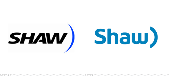
Established in 1971, Shaw Communications is a Canadian communications and media company that provides broadband cable television, Internet, home phone, telecommunications services, and satellite direct-to-home services to over 3.4 million customers combined. They also operate 18 specialty networks, including HGTV Canada, Food Network Canada, HISTORY and Showcase. As I think I understand it, Shaw ranks fourth in the telecom business in Canada behind giants Bell, Rogers, and Telus, all of whom have very strong presence so Shaw needs any help it can get to get chosen by customers. Yesterday, they introduced a refreshed logo, a new tagline — "You won't miss a thing." — new national TV commercial by Vancouver-based Rethink, and a couple of new mascots, Bit and Bud.

Shaw Communications today introduced a new marketing platform, shining a light on its foundational pillars — the power of its people and its technology.
A new logo and corporate identity are also being introduced as part of the new platform. The first update to Shaw's logo since 1998, the evolved logo represents a modern, accessible and friendly design while retaining the iconic Shaw elements. The logo's familiar half-ellipse shape will tie into the creative, playing off the shape of the network's "pipe."
— Press Release (PDF)
The previous logo was last updated in 1998, and it shows. It has that old, Microsoft-ish, angry italic thing going and an ambiguous blue swoosh. Corporate, techie, and boring. The new logo subscribes to the twenty-first-century formula of bold, rounded, lowercase typography that, as expected, help make the company appear friendlier and fresher. The evolution of the swoosh into a parenthesis shape feels both good and bad. Good in that, well, it's not a swoosh anymore, and it looks like a TXT smile — per the press the release, it's supposed to tie into this whole "pipe" thing, but we have yet to see how that plays out. And bad in that it now looks like a parenthesis without its better half on the other side; because it matches the weight and color of the name, it feels like somebody forgot something (either the parenthesis on the other side, the colon to make a happy face, or simply to take it off before launch). Nonetheless, what it does very well is to maintain continuity between old and new.

Bit and Bud, the new mascots. Against white background, above, and inside the "pipe," below.

"We're in love with the bots," said Katherine Emberly, Shaw's vice-president of marketing. At launch, viewers will be introduced to Bud (who represents "the 40-year cable veteran," says Emberly) and Bit who, as a new member of the Shaw team, is introduced to the company's offering, along with the viewer.
"We do have some other bots who are planned to come down the pipe," Emberly said, acknowledging the pun, "one for business, her name will be Biz; a bot for our satellite company, Shaw Direct, and that will be Beam; and then we're working on a media bot who will most likely be named Buzz and be that red-carpet interviewer type."
— Marketing magazine article
These Bit and Bud characters… yeah, I don't know. They feel too cartoon-y and childish for a company that wants grown-ups to buy its services.
National TV spot.
Thanks to Justin Smith for first tip.

Don't forget to cast your vote about this post online
