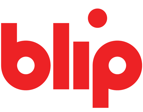
Established in 2005, Blip (formerly the annoyingly period'd Blip.TV) is a video site specifically designed for web series, as opposed to the one-hit-wonder machine that is YouTube or Vimeo, which is why many have never heard of it. It doesn't have the inherent shearableness of the other two, which is why your aunt doesn't send you FWDs of cats falling of a table on Blip. You have to go to it, just like you go to ABC or Showtime. Blip hosts over 300 million video views per month and unlike other video sites, it splits ad revenue 50/50 with the producers of each series. This month Blip introduced a new logo (and name) designed by Chermayeff & Geismar.
"Abbreviating the name to just 'blip' allowed us to create a focused mark with nothing but a slight interruption — a blip — with the dot of the 'i' shifted slightly to the right," says partner and designer Sagi Haviv. "And without the explanatory modifier 'TV,' the company can now not only express a more confident image, but ultimately even claim exclusive ownership of the word "blip" as a trade name (like Target or Showtime)."
— Chermayeff & Geismar Press Release

How Blip fits in the online landscape.
PS: If you've never tried this in a logo presentation, try it, it works like a charm. Place your logo at the center, surrounded by the logos of brands it either wants to emulate or compete with.


The old logo was terrible: bland color, generic rounded type, poor spacing, and not particularly original signal waves coming out of an engorged tittle. (That last bit is not as naughty as it sounds). The new logo is as simple and bold as it gets — some, I'm sure, will complain it's too simple — and the concept of the "blip" in the tittle being displaced is more than enough to make the four-letter wordmark remarkably distinct and unique to Blip. It's not out-of-this-world original and the execution is literally four sticks, two rings, and a dot. But they are a very nicely organized four sticks, two rings, and a dot. In terms of finesse though, I would have liked to see a small version (which exists in the guidelines) have nudges — or what print folks call "ink traps" — where the stem of the "b" and "p" meet the rings that would alleviate those characters getting a little extra bulgy in that area. Details aside, this is a great change for Blip.
Thanks to Kelly Cree for first tip.

Don't forget to cast your vote about this post online
