Established in 1962 as the Houston Colts, the Houston Astros, as they were renamed in 1965 when they moved into the Astrodome, are the Major League Baseball team for Houston, Texas. The team's best season came in 2005 when they made it to the World Series but were swept by the Chicago White Sox. In November 2011, it was announced that, after 51 years in the National League, the Astros would move to the American League, a move that balances the two leagues, now each with 15. I'm sure to actual baseball fans this has more philosophical meaning but to me, as math equations go, it makes sense. This past Friday — after MLB stole its thunder by leaking merchandise with the new logo early (and offering an apology) — the Astros unveiled their new logo, uniforms, and mascot at their stadium.
The orange-and-blue color scheme and block H and star on the cap are right out of the 1970s and '80s, during the decades many consider the Astros' golden era. The goal was to make sure longtime fans would envision the Colt .45s, the Astrodome and rainbow jerseys, while looking at uniforms that were fashionable in this era.
— Press Release (an actual good read)

Logos from the 1960s - 70s as neatly pointed out by Chris Creamer's Sports Logos.
A bit of Astros history and new look.

Primary logo.

Secondary logo.

One lock-up of the wordmark. See all variations at this page (scroll down a bit).
The old logo was extra baseball-y, with the script wordmark with swash underneath and the endless layers of colored strokes. Nothing too great, nothing too bad. The new logo, at least the monogram, is a really fantastic update. It feels sporty and powerful without the usual clichés. The slightly beveled "H" has a great relationship with the star behind it, which also has the absolute minimal shading it needs, proving that you don't need the deepest chiseling and shading Adobe Illustrator has to offer. I wish the typography was better. Not better. More interesting. Just pulling out an old slab serif from the baseball drawer of nostalgia is fine, but if it had some small tweak to bring it into the twenty-first century, it would have taken the identity to a whole new level. The uniforms are a little meh, but they are elegant and simple. The insignia on the cap, though, looks out of this world. (Get it? Astros > Houston > NASA > Out of this world > Sigh > Okay).

Home, road, alternate, and batting practice uniforms. See video here.

Merch. More here.


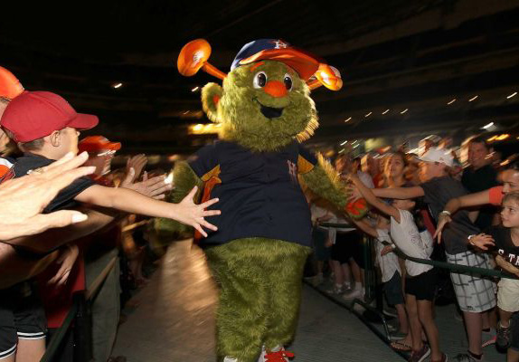
The return of Orbit, Houston's 1990-99 mascot. See video here. Warning: video insults your intelligence.
Thanks to D.J. Morgan for the tip.

Don't forget to cast your vote about this post online
