This week I am mining our sister site, Art of the Menu, for some nice restaurant identities. We focus on just the menus over there and plenty of times the identity around the menus is just as cool.
Union Jacks

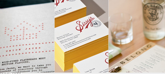
Sometimes the best identity is no identity at all. Or all identities all at once. Such is the case with Union Jacks, a London-based, Jamie Oliver-made diner designed by local firm The Plant. Their approach was "based on an attitude rather than a strict visual system" and pulls inspiration from classic British food institutions the fish and chip shop, the greasy spoon, and the pub for a "British post-war youth rebellion" attitude. The result is eclectic, fun, and endlessly iterative. [More / On Art of the Menu].

Sissy's

The Dodgers-style script wordmark is rarely pulled off well but when it's not just well executed but supported by chickens and pin-up girls, then you have yourself a winner. Like this identity by Dallas, TX-based Tractorbeam for local southern kitchen and bar, Sissy's. It takes kitsch into a whole new level of sophisticated kitsch. Plus it establishes a new trend for photographing your own design work: taxidermy. (Make sure you scroll down to the second image slider at the More link. [More / On Art of the Menu]

Cafe Belong

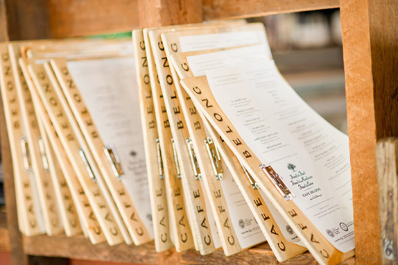
You know what I like but I never get enough of? Log typography. This monogram for Toronto-based Cafe Belong by local designer Chad Roberts — a graduate of the Louise Fili School of Awesome Typography — satisfies that need and adds some extra dashes like plenty of leaves and a lovely flared serif wordmark in a circle. The logo is applied simply and cleanly. Delicious. [More / On Art of the Menu]

Don't forget to cast your vote about this post online
