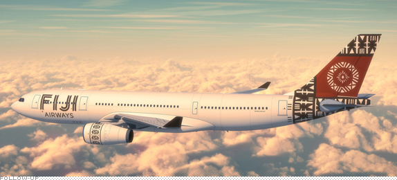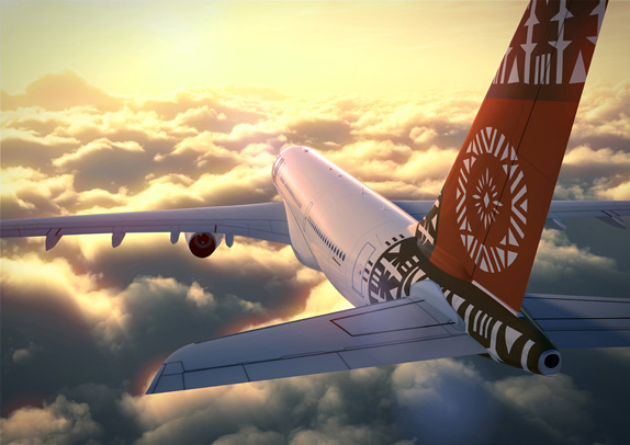
Back in August of this year we reported on the new logo for Fiji Airways, the national carrier airline of Fiji that is completing a full rebrand to be set in motion in 2013. At the time of the logo reveal, Fiji Airways preemptively announced that its livery would be introduced on October 10, Fiji Day. Here it is.
"We knew the exterior design needed to be just as distinctive, unique, and true to Fiji. Our mission was to create a proud symbol that would stand out at some of the world's busiest international airports, a symbol that would allow us to become the very best 'Flying Ambassador' that Fiji could ever have," said the airline's CEO.
— Press Release


"The distinctive Teteva Masi, designed by renowned Fijian Masi artist Makereta Matemosi, is at the heart of the new brandmark revealed last month. Featured prominently at the center of the airline's new brandmark and on the tail of the new aircraft, it represents the friendliness of Fijians' and their deep caring nature."

The Rova symbol, on the aircraft engine, symbolises the warm greeting Fijians extend to visitors, while the Makare symbol, which appears in the prominent position and scale on the front and underside of the plane, communicates the new 'Fiji Airways' name by evoking the allure of clear water flowing on a white sandy beach.

Exterior motifs: "Makare communicates the new 'Fiji Airways' name by evoking the allure of clear water flowing on a white sandy beach. The Rova symbol symbolizes the warm greeting Fijians extend to visitors."

Interior motifs: "The Qalitoka motif shows a unity of people to one mind set in executing a given task, while the Kaso Masi represents the canoe that carries villagers, farmers, fisherman and carpenters together for the success of the villages."

"Air Pacific's new Fiji Airways' aircraft will be equipped with cloud-comfortable business class seats designed by Zodiac Aerospace/Weber."
The logo already had a great response — 72% greatness approval on the Brand New International Value Scale™ — and it's probably safe to assume that we all had high hopes for the livery. Boy, did it deliver. This is one of the freshest airplane designs I have seen in a long time. The clean, white fuselage serves as the perfect canvas for the brown patterns and wordmark and for the main logo on a burst of orange. It's simple, distinctive, and sophisticated. Plus: those pillows!
Thanks to Colin Elliott for the tip.

Don't forget to cast your vote about this post online
