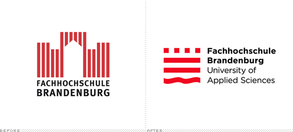
Established in 1992 in the small (pop. 71,000 and counting) town of Brandenburg an der Havel in Germany, Fachhochschule Brandenburg (wherein Fachhochschule translates to University of Applied Sciences) offers degree courses to approximately 3,000 students in engineering, business administration and economics as well as information technology and media. The university is housed in an 1880s building that originally served as barracks for the Prussian army. Last month Fachhochschule Brandenburg introduced a new identity designed by Thomas Manss & Company.

Main entrance to the university.

College President Dr. Hans Georg Helmstädter comments: "For the uninitiated punter the new mark represents an instantly recognisable, abstract, calm and modern shape. For people familiar with the campus, it evokes the main building and the four squares are also reminiscent of the gates depicted in the shield of the city — illustrating the college's unequivocal commitment to Brandenburg an der Havel."
— Provided materials from Thomas Manss & Company

"The challenge was to evolve the existing identity, building on the existing goodwill invested in the architectural symbol, yet, conveying the state-of-the-art nature of the educational programme," according to Thomas Manss & Company Partner Andreas Lerchner. Initial focus group research revealed that, in addition to the academic programme, the idyllic surroundings with their myriad waterways and leisure facilities were a big draw. The newly designed mark takes into account these findings and adds the water theme with a simple design intervention that leaves the symbol still proudly displaying its architectural origins.
— Provided materials from Thomas Manss & Company


The previous logo wasn't bad at all. It looked like a university logo. It had a decent depiction of the building — although from the few pictures I've seen of the campus I didn't see a pointy-arched door anywhere. And it had decent, inoffensive typography. The new identity manages to take what was good about the previous logo and make it better and simpler. I love the new icon. It uses, like, 10% the amount of lines the previous one used. It conveys the tower-y architecture better. And its softened by the addition of the wavy line at the bottom, that references the city's location on the banks of the River Havel. The icon also forms a perfect square — which is super hot. (To me, at least). The typography is Gothamly simple, with each line of text aligned with each "line" of the icon. It's really hard to dislike this logo. It's not adventurous or graphically explosive. It's just a lovely, conservative mark done with care for a small university.

Don't forget to cast your vote about this post online
