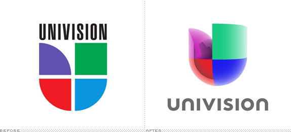
With a history dating back to a single television station in 1955 in San Antonio, TX, Univision (as it was named in 1986) today is the leading Spanish-language television network and media company for Hispanics in the United States. With programming that covers everything from the storied telenovelas (soap operas) to sports to the juggernaut that is Sabado Gigante, Univision is mostly known as a television channel but it also owns radio stations and websites. Yesterday, they unveiled a new logo designed by Wolff Olins.
"Univision has tremendous brand equity — on par with Apple, Coca-Cola and Kleenex — that far outpaces that of any other media company. Our unparalleled connection and leadership with our audience compels us to evolve with them. It is our duty and our ambition to leverage this incredible brand equity to celebrate our culture and connect America to the 52 million Hispanics in the United States.
— Press Release

The new logo, evocative of a human heart and three-dimensional in appearance, is a vibrant new take on Univision's prior logo, which represented the company for nearly 50 years since the company began as one television station in San Antonio, Texas in 1962.
"The new 'heart' logo joins the quadrants that were previously separated, representing unity, collaboration and the merging of cultures in the U.S., not to mention Univision's integration across its platforms," said Ruth Gaviria, senior vice president of Corporate Marketing, Univision Communications, Inc. "It is also three dimensional, representing the magnitude of the Univision brand and the U.S. Latino community, as well as the 360-degree approach we embrace as a company. The vibrant color palette and use of light in the design reflect the vivacity of the community we represent and its contributions to the U.S. landscape."
— Press Release

Icon in full color with effects, flat color, and single color.
As both the first quote above and Wolff Olins' assertion — "On the Burke Brand Equity score they broke the scale. Scoring the highest-ever-recorded scores for brand loyalty." — on their blog post announcing the redesign, Univision has tremendous equity in its logo, originally designed by Chermayeff & Geismar. It's one of the great TV logos: simple, memorable, perfectly executed. So the approach to keep the foundation of the logo is the correct one. The new execution by Wolff Olins is… interesting. I can't praise it too much — as I'm wont to do with WO work — because it's mostly style over substance. It's well-styled style. Of all possible 3D rendering approaches this is one of the least offensive. It's catchy like a pop song. And as far as infusing new energy into the logo in a way that the audience will still feel connected to the logo they've known for so many years, this is a good way to go about it. The extruded icon is accompanied by the rest of the alphabet from WO's work for Belkin in an ambiguously-cased, geometric sans serif. In other words, it's neither good nor bad but it's getting a little repetitive. Beyond the main logo, as you will see below is a mess of brand architectural proportions with each genre or property of the Univision network doing whatever the hell they want — I will go out on a limb and assume WO was not in charge of this part of the new identity deployment. Overall, yeah, it's… interesante.

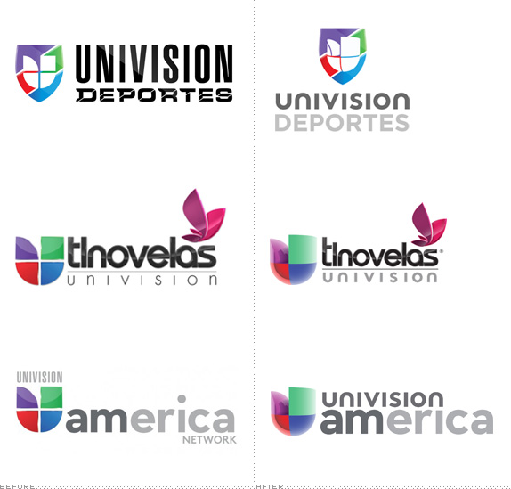
Various properties, before and after.

A few more.
Lengthy brand video. Logo animation shown at the end.

Don't forget to cast your vote about this post online
