Located in London's Islington neighborhood and housed in an 18,000-square-foot Victorian property that was, in 1855, a post office and, later in 1911, a cinema, The Halcyon is a new retail development that will be "highlighting the best of British retail, creativity and artisan dining," and will include a restaurant (The Thunderbolt), bar (The Sundower), artisan food hall, gallery, and a coffee house. The Halcyon's identity has been designed by London-based SomeOne.

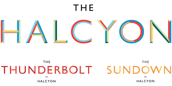
Main logo, first row. Restaurant and bar logos, respectively, second row.


Chiseled version of Gill Sans.

Pattern.
This whole project is super British-infused but you would almost never know it as there are no roundels or white-blue-and-red color combos and no Gill Sans. Well, there is Gill Sans, but it's been used to draw a chiseled version that is then colored in what SomeOne calls a "subtle nod towards the diverse colour palette used during Britain's great creative periods of the past — our Halcyon days, mixed with those we see around us today." The pattern used throughout is inspired by the work of the British artists known as the Vorticists — Google-image-search them crazies — a rarely used source of visual cues. Together, these two elements form a captivating and energetic identity that also has a very classical aesthetic to it that marries well the contemporary intentions of the development with its nineteenth-century building. We've seen multi-faceted logos and crazy patterned identities like the ones shown here but it's the combination of these two trends/styles that makes it work so well.

Brochure.


Thunderbolt and Sundower menus.

Price tag.


Don't forget to cast your vote about this post online
