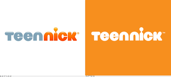
Launched in 2002 as The N, TeenNick, as it was renamed in 2009, is part of the Nickelodeon family of channels geared towards, as its name implies, teenagers. With a mix of reruns and original programming, TeenNick reaches more than 71 million households. The new name was part of Nickelodeon's large rebrand effort in 2009 with on-air graphics by loyalkaspar and now they are presenting an updated on-air look created by London-based Proud Creative.
The brief asked us to speak to the channel's key demographic, which was broadly defined as Millennials, with a skew to female. Despite their ease with technology and multi-media spaces, Millennials are still teenagers, hovering awkwardly somewhere between adult and child. We were keen that they should be characterised as much by their sophistication as their desire for play and fun.
We reflect these two sides of the audience with a modern, clean, and timeless approach to onscreen graphics. This is balanced by an optimistic, energetic, and fun approach to the live action spots.
— Proud Creative Press Release
An international version of the previous, 2011-era Teen Nick on-air graphics.


If you clicked through the loyalkaspar link in the intro paragraph and watched the video at the top, you can tell that the look of TeenNick in the last three years has looked more like a channel for teenagers watching Saved by the Bell than modern-day teenagers. The graphics were fine, but perhaps a little too flashy and graphic-y, if that makes any sense. The new work by Proud Creative and The Armoury has more of a "realistic" patina, showing teenagers in their own habitats. Despite the glossy finish and party attitude, the new footage does manage to capture some of that awkwardness that ensues from horny teenagers — hey, we were all one of them at some point, no? — who are still kids at large. I don't remember dancing that much at pool parties when I was a teenager, nor there being that much confetti. But the videos strike home more than angsty graphics.
Overall, the new look of TeenNick is more sophisticated, starting with the stripping off of the bevels and gradients of the logo, all the way to the navigational onscreen elements. It almost looks boring by contrast to the old, but it feels less pandering to teenagers and more like its treating them closer to adults than kids — hormones be damned.
On-air graphics.
Bumpers and idents.
Making of.

Don't forget to cast your vote about this post online
