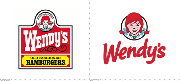
First opened in 1969 in Columbus, OH, Wendy's is the third largest quick-service hamburger company in the world, with more than 6,500 franchise and company restaurants in the U.S. and 27 other countries. To paraphrase one of the greatest spokespersons — not as great as Wendy's own (and its founder) Dave Thomas — "I don't always eat quick-service hamburgers, but when I do, I prefer Wendy's." Perhaps it's the square shape of their hamburgers but they are the least unappealing of all fast food hamburgers. Their frosty dessert thingie is awesome. Anyway. The Associated Press has reported on a new Wendy's logo that will start appearing in March 2013 on newly built and renovated restaurants — which I am assuming will follow the test stores designed by San Francisco, CA-based Tesser.

In undertaking the redesign, the company realized there were three key elements that had to be preserved; the image of the little girl, the color red and the way the "Wendy's" font swerves up — what executives call "the wave."
In the new logo, Bahner notes that Wendy's pigtails peek out from the oval frame, bringing her forward and making her more dynamic. It will be part of the new restaurant design that Wendy's is looking to expand to its roughly 6,000 locations in North America.
— Associated Press
It's well-known that Wendy's is named after Dave Thomas' daughter and the logo is based on her, at 8 years of age. It's an iconic image: The freckles, the smile, the blue-and-white striped dress, and, of course, the gravity-defying red-haired pigtails with the oversize bows. Way more complex than the McDonald's arches or Burger King's swoosh, but equally recognizable. However, Wendy's Wendy has been imprisoned for years inside a very tired-looking frame with an overly Western-ey wordmark, a strange filigree, and some crammed typography inside yet another tired-looking frame. This logo has been in play since 1983. That's 29 years. That's a long time for anything to remain fresh.
The new logo is an excellent update. All of Wendy's elements are intact, but very nicely re-rendered. The hair now has volume (and styling), as opposed to the flat helmet hair of the old logo. The bows are more plump. The dress has been cut shorter along the neck so it doesn't look like she's going to a Renaissance fair. And the freckles, and the smile, and the innocent look are all there, inside a circle and not a weird oval. The wordmark is the more dramatic change. The brushy, hand-drawn, bold script approach is great: it feels friendly, casual, and different from all other quick-service hamburger joints. There are strange things happening like the "e" connecting into the "W", the counter of the "d" being too hard-angled in contrast with the rest of the letters, and the "n" being a little wonky. But I could put a dozen of those plump apostrophes on my burger and eat 'em all up.
Overall, this is a great redesign that could have gone much worse. Having a caricature of a person is always tricky because they can overpower an identity — see the Quaker guy — but Wendy here doesn't come on too aggressively to take over.
Thanks to Lukas Gerber for the tip.

Don't forget to cast your vote about this post online
