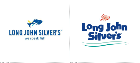
From my introduction in February 2011, when this logo last changed: "First opened in 1969 in Louisville, KY, Long John Silver's (LJS) is a QSR (Quick Service Restaurant) seafood chain with over 1,100 locations worldwide, but mostly in the U.S. Privately owned until 1998, LJS is currently part of Yum! Brands, who also own KFC, Taco Bell, and Pizza Hut." What has changed since then is that LJS Partners LLC purchased the chain from Yum! Brands earlier this year. And back in September LJS introduced a new logo, more familiar with that they had originally, as well as a new tagline, "That's What I Like", that replaces "We Speak Fish". No press release or design credit given.


TV ad, with new and old logos in play at the same time.

Clearly, someone thought the change to the more "upscale" look of the 2011 redesign was not a good idea — or maybe it just tested poorly and they decided not to pursue that route. From what I could tell — there is about five locations in Austin — no one implemented the change, with all locations still featuring the kooky typography of yore. It seems like the new logo is a better to way to mitigate this kind of transition problem, made evident in the video above: the change from the old logo on the restaurant's building to the logo on the sign-off of the commercial is not as jarring.
Had LJS made this update to their logo in 2011 it would have made perfect sense — it IS commendable that they went for revolution over evolution at the time, sometimes revolutions just backfire — as it is a decent update that keeps the silliness of the old but tempers it a bit. It's like applying a Stylize > Smooth Edges filter in Illustrator. It lost most of its attitude but it's definitely more grown up. The redrawing of the fish seems unnecessary, as it looks completely like bad clip art and the gradient at its center makes no sense. The tagline change is quite dumb: they have moved away from something that was slightly clever and talked specifically about LJS's main offering to something absolutely generic that the best I can say about it is that it works as a set up for "That's what she said." This is probably all far more philosophizing than this redesign merits, but it's always interesting to see "pivoting" identities.
Thanks to Jase Hueser for the tip.

Don't forget to cast your vote about this post online
