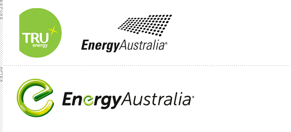
Established in 1995, TRUEnergy is one of Australia's largest energy retailers, servicing over 2.7 million customers. In March of 2011 they announced that they would be purchasing the retail operation of EnergyAustralia, a state-owned company that manages the electricity network assets (poles, wires, and substations) which, in turn, have been transformed into a new company called Ausgrid. In August, EnergyAustralia unveiled a new logo that will serve to transition TRUenergy into the name — for now the only place showing the new logo is here with both companies still operating their own websites, probably doing a slow transition into the change. The logo and national advertising campaign were created by Leo Burnett Sydney.

Spot for EnergyAustralia proper. Funny one.
Spot for TRUenergy change. Less funny, but good 3 seconds about the new logo at the :07 mark.
There isn't any information about the new logo, but there really doesn't need to be. The intention is pretty obvious: (1) to look like a power button and (2) to look green as (2.1) an evolution of the TRUenergy logo and (2.2) to cement their commitment to "cleaner energy technologies and solutions". Turning the power symbol into an "e" is a clever, if basic, move. But it works. It conveys exactly what the company does. The execution of the "e" is… elaborate. I don't even know what material it's meant to represent. Perhaps some flubber-fortified version of neon with a crystallized coating of some kind. I bet if you snapped it in half, a flare signal would shoot out into the sky. The repetition of the "e" inside the name is painful to watch. Handy if they ever use just the name without the icon. Perhaps a solid black "e" in the same shape would have been enough. The typography is fine and… yeah, it's fine. Not much more to say about it. Overall, the logo is an improvement over the two old logos — especially that chopped circle for TRUenergy.
Thanks to Danylo Motyka for first tip.

Don't forget to cast your vote about this post online
