Launched in 2004, SB Nation (short for Sports Blog Nation) is a massive network of more than 300 blogs run by paid sports writers-slash-fans. Combined, SB Nation pulls in 100 million pageviews a month through 20 million unique visitors, 80% of them dudes. While there is a mothership blog that covers sports in general, SB Nation's real appeal are its local and team blogs, dedicated to the micro concerns of fans in different cities and for specific sports and teams, i.e., there is SB Nation Chicago for all of its citizens but there is also Bleed Cubbie Blue for the MLB's Cubs, Windy City Gridiron for the NFL's Bears, and Blog a Bull for the NBA's Bulls. Over the years, each blog has been given free reign to design its own logo based on its own puny, insider-ey name — the result has been humorous yet mostly crummy, rectangular pieces of artwork. Earlier this month, in preparation for a relaunch of the look and functionality of its blogs, SB Nation introduced new logos for ALL blogs through a unified approach, designed by London-based Fraser Davidson. ALL of them, designed by Fraser Davidson. 300-plus.

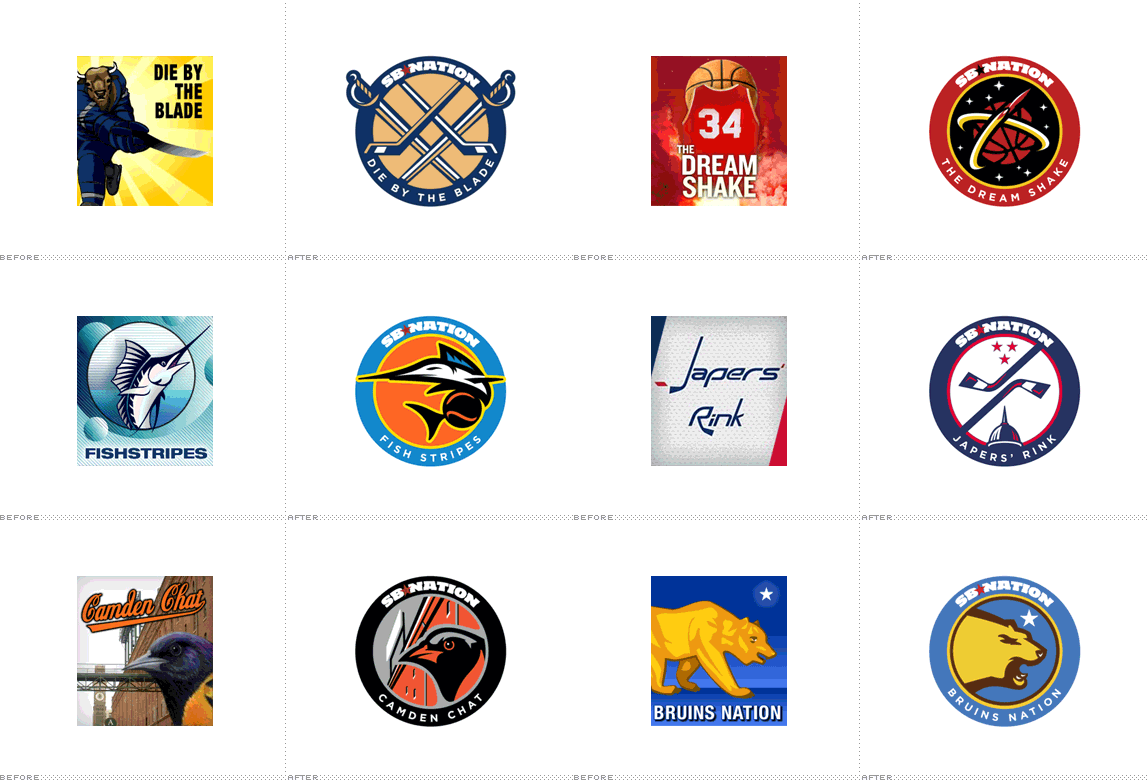
A small sampling of old logos.

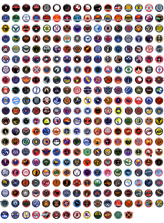
All new logos.


SB Nation has posted a great behind-the-scenes of the process as well as a summary of all the new logos. To understand the herculean task, here is a snippet:
With a format chosen and a designer ready for more, the hard work began in earnest. We refined the legacy questionnaire template so bloggers could suggest elements and ideas, and have meaningful input on their marks without much effort. Some bloggers wanted to keep the soul of their old marks, and asked to port existing imagery into the new format. Others chose to change it.
It's no easy task to have 300+ branding conversations in 7 weeks.
The questionnaires became creative briefs, which we passed to Fraser so he could work his voodoo. Each new design he returned was run by our legal team. (Since our sites are not official team blogs but still identify closely with teams, we need to be careful about trademark violations). Following legal approval, we'd send the mark to the bloggers for review. Because of this project's size and scope, we limited revision rounds to just one. Thankfully, the overall reception to this change was positive.
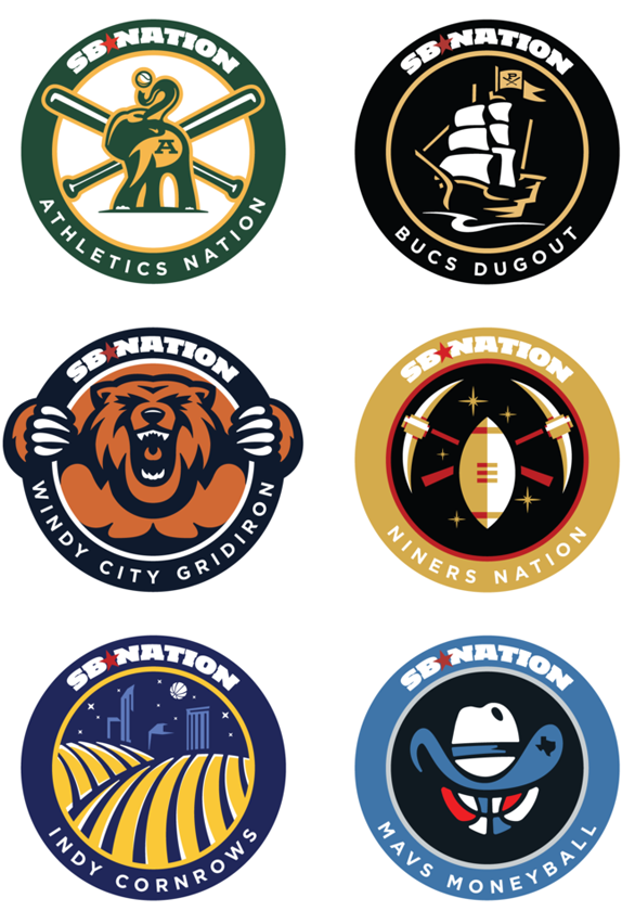
I have no intention of critiquing every single logo. Some of them are fantastic, others are lame. Some are perfectly executed, others are a little funky-looking. It doesn't really matter. It's the overall effect and shock-and-awe effect that the redesign has: (1) it instills a sense of confidence among SB Nation readers that these blogs are not fooling around and mean business and (2) it makes it easier to jump from sport to sport or city to city and find consistency not just in the format of the logos but in their high quality. These are 300-plus great sports logos, with all the pros and cons of looking like sports logos. But many professional sports teams would be lucky enough to look like any of these 300-plus logos. Did I mention 300-plus logos were created? In seven weeks. It's pretty amazing. This is the equivalent of a hat trick, a home run, a 360-two-handed slam dunk, and punt return touchdown all in one.
Thanks to Kevin for the tip.

Don't forget to cast your vote about this post online
