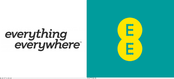
Established in 2010 as the parent company for Orange and T-Mobile, Everything Everywhere is the UK's largest communications company, providing mobile and fixed-broadband communications services to more than 27 million customers. Yesterday Everything Everywhere — who is making a big push to move the UK into full 4G service — announced it would rebrand as EE, a "superfast customer brand offering 4G mobile services and fixed fibre broadband, and it will open revamped EE-branded stores." The EE consumer brand will be part of the Everything Everywhere family, along with the Orange and T-Mobile brands. EE plans to introduce 4G across 16 UK cities by the end of 2012, with 98% population coverage planned by the end of 2014. The new identity has been designed by Wolff Olins with custom typography by Miles Newlyn.
Additional credits for this project:
Motion language conceived by Wolff Olins and Thomas Eberwein.
Development and refinement Wolff Olins, Zeitguised and Man versus Machine.
Brand film Wolff Olins, Thomas Bryant, Archers' Mark and Time Based Arts.


The EE network helps people do things they couldn't do before. We have brought it to life in our visual identity through what we call the Smart Layer. The Smart Layer is made up of a grid of particles, these particles are an expression of the network. They make everything: Our logo, our typeface and our iconography. In motion they react and respond showing the many ways EE can help you every day.
Provided Materials by Wolff Olins
Brand video.
Logo animation.
Colour is an important part of our brand. It allows us to stand out and be recognisable in a busy world, and also allows us to be consistent and clear. Our colour palette leads with Aqua and Yellow and is supported by Ivory and Grey, so we can be both bold and bright or smart and sophisticated.
Logo animation interacting with live action.


We have our own typeface.
Its called Nobblee.
Its made from the smart particles so it allows us to be instantly recognisable as EE, even when type is seen by itself. Nobblee is designed as a typeface that can naturally animate, form and disappear or respond and react to different inputs.
Icon and type animations.
Our photography should celebrate everyday moments of interaction with our network, propositions, service and experience. We use photographs of people, products and, occasionally, places.
Our icons and illustrations play an important role in our brand. Not only do they help people navigate, they help us explain our propositions and offers in the most simple way…


Alright. That's a lot of stuff to see. I assume you've made it this far. I thought it was important to see everything before delving into the opinion as when I first saw this launch I had only seen the little that was available online and it didn't quite inspire me. I had even already written a review that was 50/50 positive/negative. Seeing everything together makes a big difference. I was initially concerned about all the dots: The logo is made of dots, the custom font is made of dots, the icons are made of dots, the background patterns are made of dots. In that regard the identity becomes repetitive pretty fast. Wolff Olins explains that all these dots are born out of the "Smart Layer," a grid of particles, particles that visualize the 4G network; kind of like The Matrix but with less doom and gloom. So when you watch the brand video at the very top, you can see the particles at work, everywhere and responding to its environment and people and things around it. It's a pretty cool effect. From these dots are born the logo, custom type, and icons.
The logo is simple, sure enough, but it's also kind of awkward encased in an 8-shape; its symmetry drains it of energy in its static form. Luckily, the Smart Layer and the particles are what give life to the logo and the rest of the identity. I absolutely love how the typography and icons engorge and clog up and react as well as how the logo comes together and makes its centers, both of them, hollow. It's hard to convey the movement statically as seen in the EE site (and photographic images directly above) where the icons look like blobs mid-formation and the dot background look like it's snowing year-round. The potential is clearly as a great living identity but in its static form it still needs to figure out how to capture the same energy. Nonetheless, this is identity at its most ambitious: building a brand through a visual language and parts that make up the bigger story rather than placing all the weight on a logo's shoulders.

Don't forget to cast your vote about this post online
