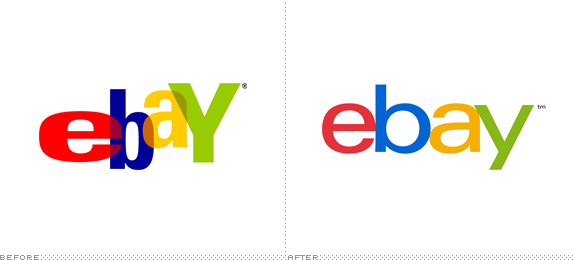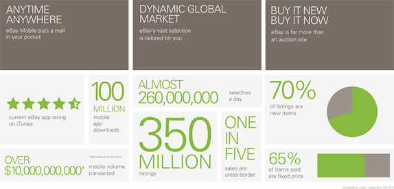
Established in 1995, eBay is "the world's largest online marketplace" with 100 million active users around the world that have generated over $10 billion through 350 million listings in seventeen years. I have contributed many times, most notably the purchase of an Atari 2600 in 2001 — not as fun as I remembered it being in 1982. But I digress. eBay has evolved from an auction-only dynamic — that could create some of the most heart-pounding moments in e-commerce if you really cared about getting an item — to a less-than-exciting but very powerful shopping platform with "Buy It Now!" buttons with fixed prices that now account for 65% of items sold. Going to Best Buy is easier and gets you better prices sometimes. With a new website and online experience reportedly coming in mic-October, eBay has announced a new logo designed by Lippincott. A dedicated announcement page is here.

Our refreshed logo is rooted in our proud history and reflects a dynamic future. It's eBay today: a global online marketplace that offers a cleaner, more contemporary and consistent experience, with innovation that makes buying and selling easier and more enjoyable. We retained core elements of our logo, including our iconic color palette. Our vibrant eBay colors and touching letters represent our connected and diverse eBay community — more than 100 million active users and 25 million sellers globally and growing.
The eBay logo is known the world over, so changing it was not a decision made lightly. The time felt right.
— Devin Wenig, President, eBay

"We wanted to reflect the right amount of change in eBay's new logo. The design is inspired by today's vibrant marketplace and sleeker experiences. We leveraged the iconic color arrangement and approachable form to reflect eBay's heritage and evolved it with a brighter blue and darker yellow and a streamlined arrangement to create more visual harmony."
— Su Matthews, senior partner, Lippincott
The previous, very well-known logo was designed by CKS Partners (now defunct) and is the epitome of the graphic language of start-up company logos from the late 1990s, by which I mean: amateurish, overly friendly, and conceived for display merely on screen without any concerns about further applications. Seeing this old logo die might make you feel like it was a good logo. Don't be fooled. It's a bad logo. Nostalgia has a way of clouding your judgment, i.e. my experience with the Atari 2600 mentioned above. Yes, the old logo looked fun with its bouncy letters and bright colors but, man, it's an ugly beast with all kinds of Univers styles and weights overlapped without any kind of harmony. Not to mention that the logo spells out ebaY with a capital "Y". Bet few people noticed that before. So after seventeen years and with the evolution not just of eBay's modus operandi but of the overall growth and maturity of the look-and-feel of the web we can all agree eBay needed to be brought into the twenty-first century with an identity to match. Sadly, they failed.


The new logo follows the Metro design philoso… oh, wait, wrong identity. The new logo is set in Univers extended. And, yeah, that's about it. Well, okay, if we need to point out the other important design decisions I'll reiterate what has already been stated in the quotes above: the letters touch and the colors are from the old logo. Cue fake fanfare. This logo is not bad. Let's establish that. There is nothing wrong with it. The letters haven't been mangled, the colors don't induce puking, and the ™ is, amazingly, all lowercase to match the logo. But this logo is not good either. Very far from good actually but unfortunately not so far that it demands the full berating it deserves. Of all the potential logos that could be done for eBay this is the absolute most boring and risk-averse logo that could have been both presented and selected. There is a lot of "could"s here and that's what I find the most disappointing with this redesign: there was an opportunity to create a logo as memorable — ideally for better reasons — as the old one. Instead we got a typeface out of the box with super tight tracking and kerning. Somebody call the Fun Police, they are all fired because we clearly don't need them anymore. But… BUT, I need to air another grievance which has little to do with the logo and all to do with the way this logo was disingenuously launched and the responsibility of designers when it comes to showcasing prototypes and concept work.

The above screenshot is from the launch page that features a "Conversation" Twitter box with people singing the praises of the eBay logo mere minutes after the logo launched. Please. Call me a pessimist but if these were people genuinely commenting about the logo in the most positive way and not being planted by eBay then I will retire from the game. The way this conversation box works is that it shows only the positive comments that eBay has marked as favorite, so it always stays positive. Clever, really. But evil, too.
Pointing out that the iPad and iPhone images higher up on the page are fake is like pointing out that Pamela Anderson's breasts are too. Not only is it obvious but it's not a pretty sight. If you are going to fake applications, do it right. Go the extra mile to capture the blurriness and reflections. Don't just copy-paste a vector shape on a Photoshop file. But nothing says "we are out of touch with reality" as much as this:

Quick, people, someone give me directions to the eBay store, I want to go in and buy stuff and put them in my eBay-branded shopping bags! Sarcasm aside, this is actually serious stuff. I usually applaud prototype and concept images, because when presenting to clients, they demonstrate potential and pie-in-the-sky thinking — you would be surprised how many times a product idea makes it to reality based on a solid Photoshop mock-up. But the image above is completely wrong. Why eBay would need or how they would deploy shopping bags is beyond me. More importantly, with such a manicured launch strategy, why would would eBay promote what are obviously fake shopping bags that don't support the strategy or business realities. Nowhere does it say "Coming soon: brick and mortar stores!".

Call me when this media buy gets approved.

Um… okay, that one's real. Forget "Will it fax?" or "Will it embroider?" The real question is "Will it ice-sculpt?".
In closing. Not good.
Thanks to the internet for the tip.

Don't forget to cast your vote about this post online
