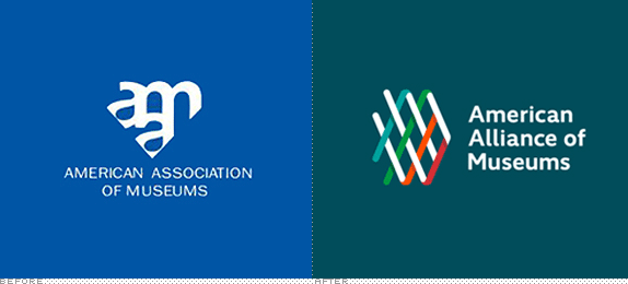
Established in 1906, the American Alliance of Museums (formerly the American Association of Museums) is a nonprofit organization whose mission is to "nurture excellence in museums through advocacy and service." By developing standards and best practices, providing resources and career development, and advocating for museums to thrive the American Alliance of Museums (AAM) supports 21,000 cultural institutions — from art, history, and science museums to zoos, aquariums, and historic sites — and individuals — from directors to curators to registrars. This month AAM introduced its new name, to reinforce the notion of alliance, and a new identity designed by Portland, OR-based Satori Engine.
Satori worked with the Alliance to identify and distill the cultural tenets that guide the organization, such as collaboration, inclusiveness and transparency. They then translated those tenets into core positions that the new identity would be based on. The core positions became:
- We are stronger together.
- Museums are essential.
- We are the national champion for museums.
- We provide a mark of distinction.
The identity design is rooted in a weave as a visual metaphor for the core positions. It's strong through its colorful diversity, yet its structure is transparent and open. It is dominant within the logomark, and contains references to "AAM", but doesn't scream it. It is a subtle way to transition the organization away from the familiar but uncompelling 3 letter abbreviation, to the more active shorthand of "Alliance".
— Provided Press Release


The previous logo looked like a New York subway car at rush hour, with all the letters piled on top of each other and no room to breathe, move, or think — one of the least pleasurable monograms I have seen in some time. Dated, needlessly aggressive, and lacking any idea. The new logo is the complete opposite: it feels fresh, friendly, and focuses on the idea of a weave (supporting the "stronger together" position) to establish a quick connection that this is an alliance of various parts. The weave-as-signifier-of-a-network may not be the most original concept, we've seen it a few times before — here (see lapel pin) and here for example — but it works and there is still a few different executions out there to keep it viable. Here, the icon is mostly abstract with hints of the diagonals of the "A" and "M" in the organization's name. I kind of wish it would resolve into an AAM at some point, but it never does. Which is fine. The subtle shadows add some nice dimensionality in the full-color version, and are well translated into the 1-color version. The typography is just about right, being contemporary and with its own subtle flair. In application, the diagonals of the logo are reused to frame information and the teal color is put to good use with sparks of orange and red. Overall, a great improvement.

Don't forget to cast your vote about this post online
