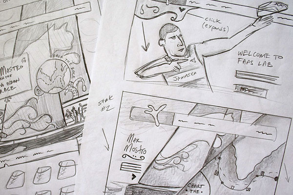
During my first year of Art School I loathed my sketchbook. Not because I hated to draw, but because I felt like I was forced to fill it. "Mr. Shifflett, how many pages did you fill this weekend?" The answer was always the same. "Probably not enough, Prof." I didn't get the reason why it seemed so important to fill these books with graphite. We were never graded on execution, just on the ability to fill the books with what we saw around us.
Then, over time I got it. It was never about how well you drew, it only mattered if you were able to catch the mood, the scene, the moment. You see, sketching isn't about nuance. It's about emotion, direction, and ideas. Broad gestures. When I figured this out sketching became easier for me and I learned to start focusing on capturing the things that mattered most, namely, the concept of each sketch.
Over time my general design processes have improved and evolved, my ideals and expectations have grown and shifted, but one thing I've never strayed from is my love for starting projects on paper. Whether it be fleshing out concepts or running art direction for something we cooked up from scratch, sketching is an integral part of my process. Over time I've refined my process (always a work in progress) and I thought I'd share a few (5 to be exact) rules that I sketch by.
1. Don't Paint a Rembrandt
The primary purpose of sketching isn't to paint a masterpiece. In fact, focusing too much on the nuances can slow your progress and will quickly force you into thinking about the details when you should be focusing on concept and direction. It's easy to get caught up in shading and detailed drawings; fight the urge! Loose sketches allow you to iterate quicker and let your ideas remain visually rough.
This is great when you are involving your client in the sketching stage of your project because it affects the nature of their feedback. People around you are more apt to provide their honest thoughts and opinions with sketches because they don't feel final or polished. In other words, people feel more comfortable providing feedback when they know ideas are still being worked out. Capitalize on that effect by keeping your sketches loose and focused around solving the main conceptual problem at hand.
2. Sketch Early, Sketch Often
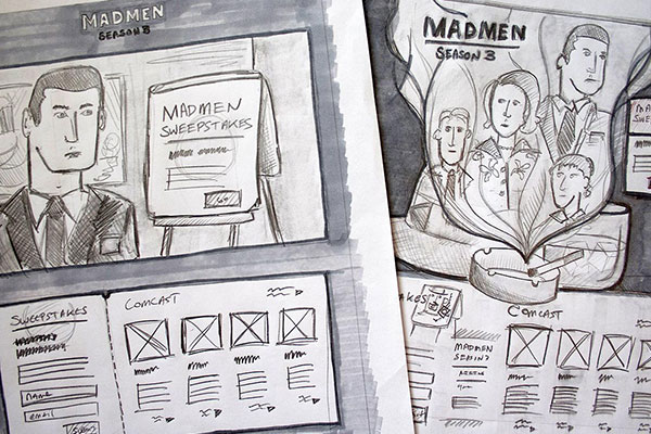
So you sketched out a few concepts and presented them to the client, now to jump into production, right? Hold it, partner. Once you have set some broad visual strokes, it's time to reign them in a bit. Now is your chance to start focusing attention on some of the details. Sketching can save you a lot of time if you find yourself having a classic case of the good ol' "Move Some Stuff Around In Photoshop Till I Pass Out" syndrome. Yeah, we've all had it. Sketching isn't just an early-project-phase sort of task, it's a skill you should use throughout the life of the project.
Personally, I force myself to take breaks and sketch whatever I'm working with on a regular basis. This gives your brain a break from staring directly into the bright, white void that is your monitor and gives you a chance to take stock of where you currently are at with production. This minor shift from keyboard to pencil is great for working through mental blocks; I've found that I come back to a comp refreshed and heading in a new direction, more often than not. Big emphasis here on getting away from your computer. It's a great tool but it's also soul-sucking. Sketching should be an oasis away from distractions like your calendar, email, etc. Carve out time for it daily.
3. Take Notes
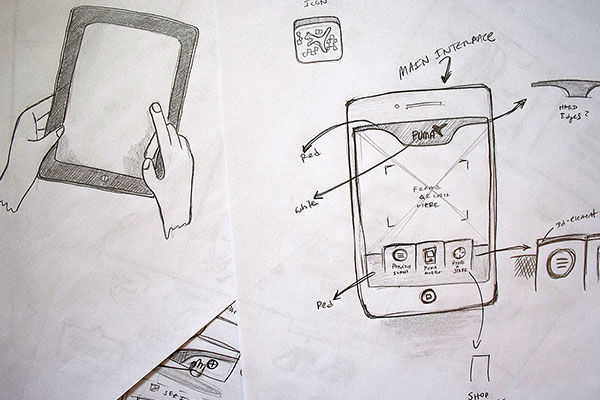
You can't remember everything. Since communication is a big part of the sketching process, it's crucial to take notes as you go along. Write in the margins or come up with a system of footnotes on a separate piece of paper; it will save you from standing around the next day scratching your head, trying to figure out what you worked on yesterday. These don't need to be detailed, they just need to help set the scene or describe what's happening. This comes in handy when you put your sketch deck in front of your client because you won't always have to talk their ear off while they are interpreting your ideas. It allows them room to explore a bit and also reference your thoughts later when you may not be around to answer questions for them. Notes also play a big role in defining interactions and transitions when storyboarding, which leads me to #4.
4. Storyboard Whenever You Can
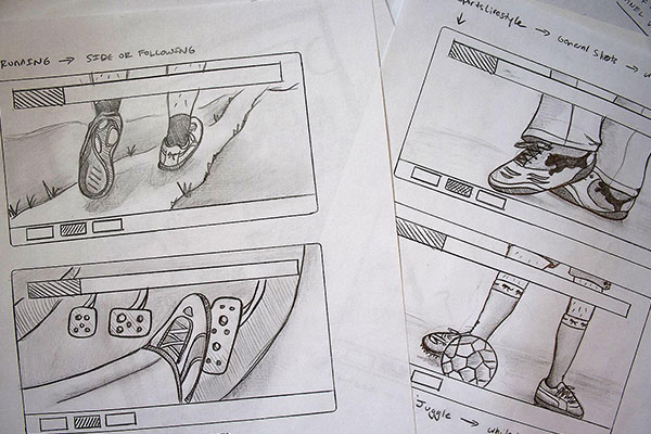
Designing for interactive usually entails a level of linear logic. Do Thing A, Thing B happens. Storyboard sketching is an easy way to quickly get ideas out on the table so they can be refined. I usually start by taking a scrap piece of paper and drawing a grid of boxes that fit the size I need for the project at hand (mobile, desktop, etc) and photocopying that paper a bunch of times to create consistent boxes. Label your boxes #1 to infinity and then get down to business. Keep in mind my first two points as you go. Remember that storyboarding is all about getting a viewer from point A to B so keeping things consistent by reusing drawn elements go a long way towards telling a cohesive story. Good storyboarding is a practiced art. Look at how cartoonists use the space and characters to imply location and intent within the cell of a comic strip. These same methods can be used for great effect when sketching out interactions and animations.
5. Add Color Where It Makes Sense
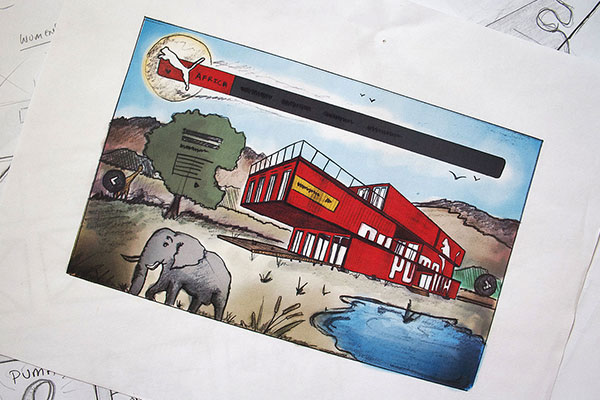
Color can add a lot to your sketches, but you don't necessarily need to break out the colored pencils to get the effect you are going for (unless you want to!) I have a little trick that I use to quickly add color to my sketches that has worked well for me in the past. After you finish up your sketch, scan it and crack it open in Photoshop. Multiply the sketch layer and lock it. Next, create a new layer under the sketch and start to draw in color with your brush tool. I like to keep a 90% hard brush to keep the color edges crisp with a bit of bleed. Go to town adding as many layers as you need, as long as you keep any new layers underneath the top sketch layer. This basically turns Photoshop into a high-end paint-by-numbers app and I love the effect you can quickly get by stacking colors.
That About Covers It
Sketching is pretty much the greatest. It puts us in touch with the very core of what design is: ideas and concepts that are visually brought to life. It forces us to stop and think about the big picture and literally get our hands dirty, which is an easily forgotten element of our craft in the age of undo, cut, and paste.
So go on, get out those pencils and scratch paper. I recommend sharpening up a Mirado Black Warrior #2 which is the best pencil ever made. Seriously.
