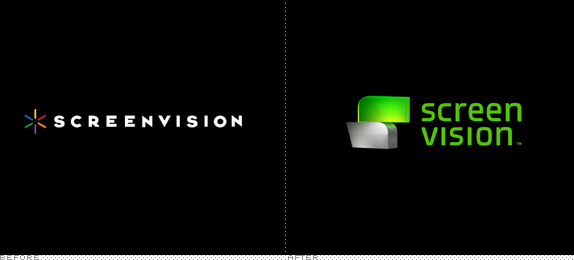
Established in 1976, Screenvision provides national and regional advertisers with on-screen advertising, in-lobby promotions, and integrated marketing programs in 14,400 screens, 2,380 theatre locations, and nearly 400 universities across all 50 States. In other words: if you get to your movie theater very early, all the stuff playing on the screen to keep you relatively entertained, is probably by Screenvision. They recently introduced a new logo, identity, and complete in-theater experience, designed by bi-coastal branding agency, loyalkaspar.
Old logo animation. Not done by loyalkaspar.
We created the Screenvision and Screenfanz logos from two shapes that stacked together to form the S in both names. These shapes informed the entire graphic language and iconography of the brand, manifesting themselves across the various platforms as icons, buttons, holding devices, printed collateral and even graphic worlds. Those worlds made up the branded environment of Screenvision, serving as the visual base for promos, trivia slides, content intros, standalone interstitials and, of course, the home of CMOR, the brand mascot.
— loyalkaspar Case Study
Main branding.
Outro sequence.
No phones sequence, with space for theater logos.
"Soundtrax" screen.

Sample of old trivia screen.
Trivia screen.

![]()
Range of icons, above. In use on the mobile app, below.


Hopefully after all those videos you are still with me. The first thing necessary with this project is understanding the context of where and how it is experienced, and, more importantly, how it's been done in the past. Pre-movie entertainment is not about high-end, sophisticated design — I'm not implying that this work is low-end or cheap, but the aesthetic is not something we would all gravitate to — but about quick bursts of visuals and sounds that capture your attention and get you to direct your eyeballs to all the paid content in front of you. Up until a few years ago, pre-movie entertainment consisted of still "slides" that were as entertaining as the carpeting of the theater but recently they've become much more of a production and are invariably laden with After Effects shenanigans and weird visual metaphors.
Loyalkaspar's contribution to the genre is not my bucket of popcorn in lieu of cup of tea, but the execution, pace, and graphics all succeed in creating a small piece of entertainment that has to appeal to everyone from a 5- to an 80-year-old. The whole vibe is a bit Tron meets Nickelodeon, and that's not a bad thing. The effort is even more commendable given the look and feel of the previous version, which wasn't particularly entertaining. In terms of the logo, I liked the simplicity of the old one but if it lacked anything it was excitement and seemed more appropriate for a film studio. The new logo has a groovy, futuristic appeal that goes along with the in-theatre experience. Overall, this review could have been boiled down to "this whole thing is gaudy and I hate it" (which is my gut reaction) but it's all about context and audience and their expectations, where this succeeds positively.

A few stills to finish.


Don't forget to cast your vote about this post online
