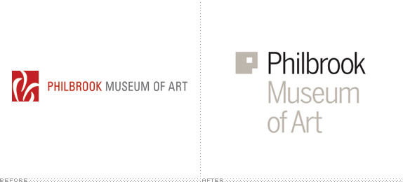
Housed in a 1926 Italian Renaissance-style villa built for oilman Waite Phillips in 23 acres of land and gifted to city of Tulsa, OK, in 1938, the Philbrook Museum of Art is home to an expansive collection of everything from Native American to African to Asian to European to contemporary art. In 2013, the Philbrook will open a new location to complement the villa in the historic downtown Brady District, a growing arts area in Tulsa. The new identity, which is inspired by the two locations, has been designed by Pentagram partner Michael Bierut in collaboration with partner Eddie Opara, who designed the website.

While doing research for the logo, Bierut, Opara and their designers happened to divide the city into a grid and discovered that isolating the areas of the museum's two locations — Villa Philbrook and the new expansion downtown — formed the shape of a letter "P," for Philbrook. The form also resembles a human face, a subject of artists throughout history. The identity projects a warmth and accessibility that connects the museum to the community of people who enjoy its programs.
— Pentagram Blog Post


The old logo was completely forgettable; it's hard to tell what it even is. Its only saving grace was that the typography wasn't horrible and it established a hierarchy through color of "Philbrook" being the more important aspect of the name. The new logo comes from one of those great Eureka moments where you find something that is both appropriate and relevant to the client and very fulfilling for the designer. The P that results from the map grid makes for a very strong icon that doubles as the letter and an abstract face. As much as I like it, the one disconnect I feel is that the icon skews too heavily towards modernism — particularly reminiscent of 1922's Bauhaus signet by Oskar Schlemmer — clashing with the Renaissance villa and a large part of the collection. It will most likely feel better in the new downtown location. The use of Benton Sans for the name helps offset some of the aforementioned concern with a more "classic" look.
In application, the icon plays the logo-as-window game, which we all know is always a client-pleaser and is hard to argue against, especially when this window is the equivalent of a floor-to-ceiling window in a giant loft — the images display great. More than the window approach I like how the two empty spaces in the P serve as holding spots for smaller typography and the die-cut invitation shows that there is room for plenty of other creative applications.

Proposed restroom signage. Too Playboy Bunny-ish?

Don't forget to cast your vote about this post online
