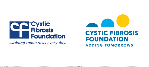
Established in 1955, the Cystic Fibrosis Foundation (CFF) is a nonprofit donor-supported organization dedicated to the search for a cure for cystic fibrosis, an "inherited chronic disease that affects the lungs and digestive system of about 30,000 children and adults in the United States (70,000 worldwide)." CFF is one of the leading organizations in innovative research, comprehensive care, and overall funding into the development of new drugs to fight the disease. Last month CFF introduced a new logo, designed by Alexandria, VA-based Grafik and shortened its tagline.
The new mark bears the words, adding tomorrows — the organization's tagline — and features the image of a rising sun, symbolizing past progress and hope for the future for all people with the disease.
— Press Release

Brand video.
The old logo was hard to look at; a monogram of a "cf" ligature — two letters that couple together as good as an ox and a turtle — that sat too tightly in a square and looked more like the sponsor of the 1984 Plumbers Association of America National Expo. The type wasn't bad. The new logo takes its cue from the uplifting tagline, which works much better without the "every day", to create an equally optimistic icon of a rising sun. Thanks in part to CFF's efforts, life expectancy of someone diagnosed as early as two years old has increased from 18 to 30 or 40 years. "Adding tomorrows" is not just a catchy phrase, it's something they've made possible. True, the same could be said of many other disease-related foundations and the tagline and logo could be applied to any number of nonprofits, yet CFF is taking good ownership of it and rallying around it. The icon is perfectly executed with just the right balance of size, spacing, and color — the latter especially effective on a dark blue background as used in the website. The typography is fairly nondescript, perhaps on the heavy and tight spectrum but it helps establish an horizon line for the sun. Overall, I really like this logo; it's appropriate and relevant to CFF's message.
Thanks to Fernando Seminario for the tip.

Don't forget to cast your vote about this post online
