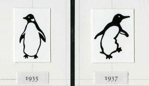
Designed by Edward Young, photo via The Telegraph
“It started with the simple logo and name, suggested, allegedly, by a typist who was earwigging the board meeting. Allen had already hit upon the idea of an animal logo, inspired by the template offered by the contemporary publishing house The Albatross Library. “It was the obvious answer, a stroke of genius,” said Penguin’s original designer, Edward Young. “I went straight off to the zoo to spend the rest of the day drawing penguins in every pose.” The clear logo was matched with the archetypal modern, but not too scarily modern, typeface, Gill Sans, and the now classic three-band cover, with colours related to the subject: orange for fiction, dark blue for biography, etc.”
Quoted from The Guardian.

Photo via The Fales Library
“Edward Young, who designed Penguin’s famous ‘dignified but flippant’ logo and the colour scheme for its book covers was a submariner during the war. His boat was involved in a collision which saw it sank to the bottom of the North Sea, but Young escaped by swimming to the surface.”
Quoted from jkr’s new book Champions of Design.

Penguin’s original logo designer, Edward Young, pictured above right
Edward Young’s obituary in The Guardian.
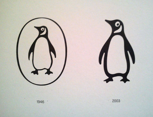
The version of the logo you’ll be more familiar with is typographer Jan Tschichold‘s 1946 modification, and subsequent 2003 fine-tuning by Pentagram‘s Angus Hyland.

Image via The Terrier and Lobster

Photo from Angus Hyland and Steven Bateman’s Symbol


Image via Penguin Logo Guidelines
A classic logo. A classic brand.
