Established in 1939, Sara Lee Corporation is a global manufacturer and marketer of consumer brands that span coffee, tea, and meats and include the eponymous Sara Lee (deli and desserts), Jimmy Dean, Douwe Egberts, and Hillshire Farms. Earlier this month Sara Lee announced that it would be splitting the company into two "pure-play" companies — each focusing on a single category of products — the first to be renamed Hillshire Brands taking over the North America production of meat-centric food products and foodservice operations while D.E MASTER BLENDERS 1753 (all caps!) will focus on international coffee and tea. The focus of this post is on Hillshire Brands; logo for D.E is noted for reference at the end of the post. The new logo was designed by Minneapolis, MN-based Duffy & Partners.
The Hillshire name was inspired by the Hillshire Farm brand, which Sara Lee acquired in 1971. […] "A key goal was to retain the strong equity with consumers and customers that the Hillshire name brings us," added Connolly. "'Hillshire' is a name that stands for quality, integrity and superior taste."
The company has also adopted a new visual identity to help position Hillshire Brands as a leader focused on providing innovative meat-centric brand and snack solutions, but at the same time, create a distinction between the new corporate name and the leading Hillshire Farm brand.
— Press Release


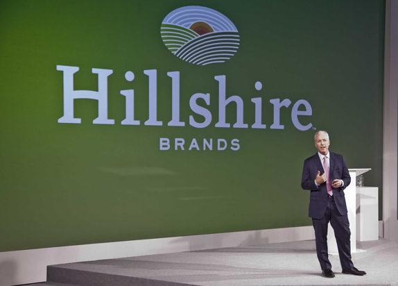
CEO Sean Connolly presents the new logo.
The absolutely most misguided logo video ever. Looks like a rave (or an NBA game) is about to start.
On first impression the move away from the Sara Lee name may seem like a mistake as it has quite of bit of equity. But mention Sara Lee and people think of desserts, a very small fraction of the company's products and just one of more than 50 brand product names in their portfolio. "Hillshire" on the other hand is more appropriate for a company now focusing on meat products, based on the Hillshire Farm brand. But that's when things can start to get confusing between corporate names and logos and consumer brand names and logos so the one good thing that Sara Lee has done was commission a very different corporate-level logo — a welcome effort given the similarities between the current Sara Lee Corporation and Sara Lee consumer logos.
The new Hillshire Brands logo loosely references farms with its rolling hills of crops and the sun rising behind them against clear blue skies. It's a nice image and it's executed nicely if perhaps a little too tightly wound with so many white lines. Perhaps three quarters of the divisions of each block of color would have sufficed and I definitely wish the sun used the same approach. The "Hillshire" typography is quite surprising in that it's very unconventional with those reversed/cropped serifs that I'm not yet sure if I love or hate — feelings that extend as well to the bridged crossbar of the "H". The "BRANDS" text at the bottom feels a little small and disparate from the rest of the look but if the idea was to downplay it, then mission achieved. Overall, I like the new logo and in terms of establishing a clear move away from the Sara Lee brand, it works.

The other half of the company spin-off, noted only for reference.

Don't forget to cast your vote about this post online
