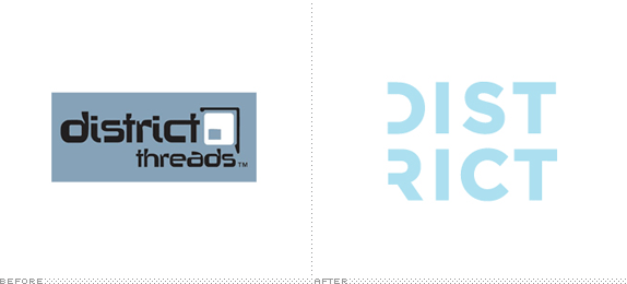
First sold in 2005 and originally known as District Threads, District and District Made are two clothing lines offering t-shirts, bags, caps, and accessories that feature "fashion forward style, slim cuts and eye-candy colors in Juniors and Young Mens sizing." Owned by SanMar, one of the largest suppliers — and exclusive distributors of brands like Gildan and Hanes — of wholesale, "blank" apparel and accessories, District is positioning itself to compete against fashion basics lines like American Apparel and Gap. Last week, SanMar introduced the revitalized brands and their new identity designed by Seattle, WA-based Creature.
Creature set out to build a strong brand position that gives the brand a unique space in the fashion world, while not alienating the family friendly shops and bulk corporate purchasers they still rely on. They based the new brand on its heritage of providing clothes to artists and hobbyists who add their designs and touches to the clothes to make them their own. Creature re-crafted the name and built a dynamic, high-energy language around the idea of an artist district: a place where all are welcome to join and create with clothes.
— Creature-provided text


Main logo, and the two sub-brands of lines of clothing.


There is no need to go into the old logo. I mean, just look at it. Clearly, no way of competing with the big boys with that thing. The new identity, in contrast, is completely primped to appeal to the youthful audience it's vying for. Starting with the logo and all the way to the casting of the models for the photoshoot, everything in this project feels perfectly calibrated and tuned to compete with American Apparel: where AA is the disenfranchised, gloomy, eye-rolling youth, District is the complete opposite, exuding happiness, optimism, and belonging. Positioning-wise, it's perfect. Execution-wise, it's pretty darn good too. Lots of Gotham, though, so if that type selection turns you off then this whole thing might be a bore. I am a Gotham Man myself, so I find this quite gratifying because it makes the best use of it in its bold, black, and ultra weights — especially enjoyable when paired with the barely-there underlines. Although I'm sure there will be detractors, it's hard to dislike the scope of the brand and how well coordinated everything is to communicate cheerfulness and youthfulness.


Design guidelines.


Brand book.

Catalog sample spread.
Brand video.

Don't forget to cast your vote about this post online
