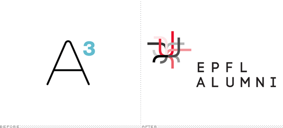
The A3 EPFL Alumni Association is, as its name evidently implies, the alumni association for the École Polytechnique Fédérale de Lausanne (EPFL), a higher education institution established by the Swiss Federal Government in 1853 devoted to engineering and science. With close to 9,000 enrolled students in undergraduate and graduate courses, EPFL is constantly ranked among the top universities in the world and its alumni include CEOs of Logitech and Danone, among other notables. The alumni association is a network of more than 18,000 graduates of the EPFL and it recently introduced a new identity designed by Geneva, Switzerland-based Enigma.
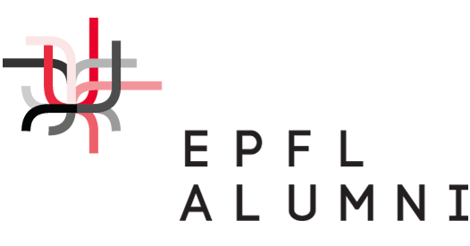
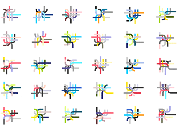
This unique organization consists of former EPFL students, which form an exclusive community. What they have in common is that regardless of where they are from, they have studied at EPFL. […] We wanted to create an identity that would reflect this unique character; we followed a process called generative design. This hybrid approach is based on programming and algorithms; it allows the designer create a system of rules that generate numerous results. Dots were arranged into squares and defined curves that represented paths. This was a metaphor for the EPFL students that move around campus; in turn, these various curves create a unique shape. This design can be expressed in an infinite variety of shapes and colors. Thanks to a mathematical software and to random parameters, 100,000 different logos were generated in one day.
— Enigma Case Study
Video explanation.


Detail of the application to generate logos.
It might be something lost in translation but I'm still not quite sure where the A3 naming comes from, as I only saw two As in the reading I did, one for Alumni and one for Association. But I digress. The old logo was fine; I don't think alumni associations need to have the best logos in the world and this one, far from the best, is also far from the worse. The new identity feels like a big ordeal for such a relatively small application but I always enjoy when designers make more from what they are given. This project probably called for a simple logo redesign and pretty, new materials, not a system that generated 100,000 logos. The basic premise is competent and clearly alludes to a varying network of people taking different roads but stemming from a central point. The execution is solid too, with the lines perfectly straight and the corners well rounded. But there is something oddly generic and cold about the final result, feeling too much like a thickened European metro map. The more positive view is that it does look engineered and even science-y, perhaps evoking a cell growing or something groovy you would see under a microscope. Overall, it's an interesting exercise that does have relevance to the organization it represents.

Don't forget to cast your vote about this post online
