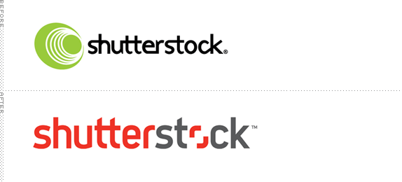
Established in 2003, Shutterstock is a provider of stock footage, stock photography, vectors, and illustrations, with a library that includes more than 19 million royalty-free images and over 500,000 footage clips from more than 35,000 contributing artists. Shutterstock gained some recognition for going against the pay-per-image-and-its-resolution with a subscription model that allows users to download as many as 25 images a day. This week Shutterstock introduced a new identity guided by Matt Angorn, Shutterstock Vice President and Creative Director, with Lippincott.
What you probably noticed first, after our dramatic color change, is something special going on with the "O" in Shutterstock. We call it the Viewfinder, and it's there to allow us to showcase our vast, constantly updating collection of amazing images and videos. The Viewfinder symbolizes the artistic empowerment of Shutterstock customers and contributors to express their unique perspective — whether they're behind the lens or in front of the screen.
— Shutterstock Blog Post (suggested reading)


I remember when Shutterstock first launched and liking its blunt, little camera logo. But with every iteration it devolved until it reached some drastically annoying typography that seemed to have subscribed to a service providing up to 25 unnecessary ligatures a day. The new logo is a very welcome distancing from whatever path their identity was on and they have focused on a single, simple idea of the viewfinder as the "o" of the wordmark. It's a basic idea but it's executed very well. The slightly condensed and bold sans serif provides a hefty presence and highlights the "o" nicely. I hate "u"s and "r"s without full stems but I'll let it pass as just a personal issue. More importantly, the viewfinder and typography work very well in action.

Brand launch video.
The 'o' in 'stock' frames the opportunity, coming to life as an aperture that reveals a unique point of view. It can be either a viewfinder that closes in on the perfect result, or a window that opens up to an endless source of inspiration and creativity.
— Lippincott Case Study

"Another aspect of the Viewfinder we love," explains Matt Angorn, Shutterstock VP and Creative Director "is its ability to highlight meaning in an image. It works for capturing a moment in time or a detail that changes your perspective."
The viewfinder application is no different in concept from National Geographic's or Time's yellow and red frames respectively, but its ability to expand and contract to highlight an element in a photograph or accommodate a visual within the logo or other words is what makes it stand out. The overall mood and aesthetic of the new Shutterstock reminds me of the late 1990s early 2000s look of the then independent, rights-managed Photonica stock house, which at the time had an edgy upscale look. While this is more mainstream — after all, if you do use 25 images a day, they cost $0.33 each — Shutterstock has managed to elevate its brand positioning.


Don't forget to cast your vote about this post online
