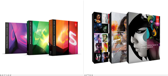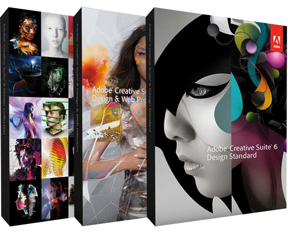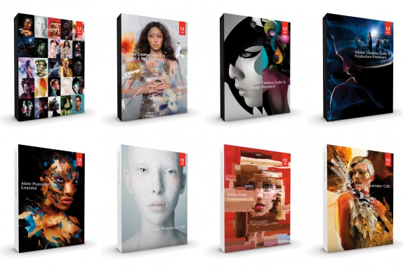
Adobe Creative Suite needs no introduction: we all use it, and we all desperately try to keep up with their upgrades and their rising price tags. This week Adobe launched its latest version, CS6, which includes a whopping 19 applications and is divided in four main suites. Like its predecessors, CS4 and CS5, the packaging and graphics have been designed by San Francisco, CA-based Tolleson Design, who have put together a very comprehensive case study with video and behind the scenes here — some of the more relevant images are included in this post.

The different creative suites.


All main applications.

The systems for each application.

Heroes.

Supporting graphics.

"Totems."
We wanted to impact every touchpoint in the CS experience, so we proposed that Adobe look beyond software -- celebrating the creative freedom of its users and the emotional power of the creative process. Being truly committed to creativity, Adobe embraced the idea.
— Tolleson Case Study
Of the three CS identities that Tolleson has designed CS4 is probably the best. Stark and minimal, with just enough visual candy to keep it interesting. CS5 was fine, but you can see the move into more complex territory. And now we have CS6, which is completely over the top in more ways than one. Some good, some bad. Let's start with the bad. The main focus is on the "Heroes." Extremely pretty men and women that have been Adobe-fied with filters and crazy effects — some pretty impressive, others impressively annoying — who inhabit the packaging and advertising. Nothing makes me feel more distant from a product than people I don't relate to and these beings have nothing to do with the hours I spend in InDesign, Illustrator, Photoshop, Dreamwever, and Acrobat. They are not anything I aspire to in who I am or the kind of work I want to do. I doubt I am alone. One of the assumptions that I am guessing Adobe made is that its audience has grown beyond just graphic designers and their dominance on the design and production software market has led to a more mainstream consumer, so something more generally aspirational or something that looks like you could pluck it out of a newsstand next to Us Weekly will have more appeal. To my eyes, CS6 has jumped the shark.
Despite my dislike of the Heroes, the system that Tolleson has designed is quite amazing and ambitious. I especially like the broken typography and fragmented graphics, which harken back to postmodernism and dot-com era shenanigans but combines them in a mature way — if that makes sense at all. Throughout the applications there is a strong energy and everything ties together very well. I know I sound contradicting and, indeed, I'm torn. I want to like this all the way, but the üher fashion approach just turned me off too much.

Don't forget to cast your vote about this post online
