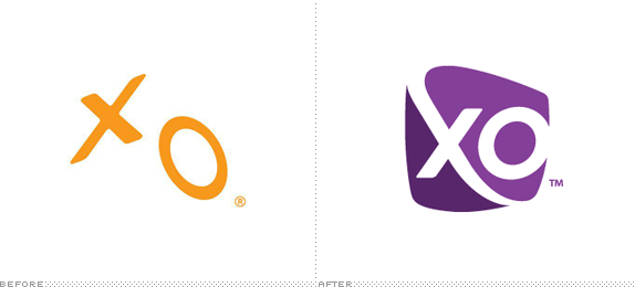
Established in 1996, XO Communications is a "nationwide provider of advanced communications, managed network and IT infrastructure services for business, large enterprise and wholesale customers" providing internet service, networking, cloud computing, among other services. They have more than 3,200 employees and serve 85 metropolitan markets. Earlier this month, XO Communications introduced a new identity. No credit was given — leads welcome.
Our new logo shows a focused, modern, bold and approachable company. The simplicity of the logo speaks to our focus. As an icon with an "app-like" look to it, it is modern. The swoosh through the "X" highlights our boldness. The soft edges and open "O" show that we are easy to work with, open and approachable. And the color symbolizes the superior quality of the services and support we provide.
— The New XO Brand Story
Brand introduction video. Long-ish. Logo animation at the beginning.


Brand book, presented covered in fairy dust.
Usually the old logos we show are definitely begging to be taken out of rotation but this one seems like it still had some legs with some finessing and a better color palette. The floating "XO" at opposing perspectives had a nice tension and having it be seen from the bottom up is as good a concept for "cloud computing" as any. It also had a bit of an edge to it, which is now completely gone in the superbly generic new logo featuring one of the biggest new swooshes we have seen recently. And that's just the first element that's wrong. The Flinstones-esque holding shape is awkward and it does not get any better when it is repeated in more colors and overlaid. Then there is the italicized "O" against the not-so-clearly italicized "X" that bumps out of the holding shape. It's just a weird, little monogram. Perhaps the one saving grace of the identity is the choice of the thin sans serif that looks quite nice when italicized and blown up but, other than that, there isn't much improvement.

Logo on lobby and on polo. On Facebook, the caption reads "Chad Couser, the mastermind behind XO's new brand." He handles Marketing Communications and PR for XO Communications. So not sure if the credit stops there, with design in-house.


Cover and inside cover of brochure.
Thanks to Lukas Karlsson for the tip.

Don't forget to cast your vote about this post online
