Colonel's Second Tour

Established in 1952 with its first franchise location in Salt Lake City, UT, Kentucky Fried Chicken (KFC) — headquartered in Louisville, KY — is a fast food restaurant specializing in fried chicken. Buckets of it (since 1957 when the concept was first introduced). Today, KFC has more than 18,000 outlets in 115 countries around the world. Earlier this year, KFC brought back its founder, Colonel Sanders, as the centerpiece of its brand and marketing efforts. After an ad world kerfuffle of some kind, KFC moved its business from FCB to Wieden + Kennedy who instituted Saturday Night Live alum Darrell Hammond to play the part of the Colonel with vintage aplomb. Along with Mr. Sanders, came a graphic throwback to vintage KFC packaging designed by New York, NY-based Grand Army.
Launch ad for new campaign by W+K featuring SNL alum Darrell Hammond.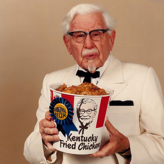 The original bucket with the original colonel Sanders.
 As part of a comprehensive rebrand and repositioning for KFC, GrandArmy was asked to re-imagine the brand's identity and visual language. Everything from buckets to napkins to signage was re-thought, and our first target was the Colonel. We simplified and stripped back the legendary Sanders, mixing heritage with a modern, flattened rendering of KFC's iconic founder. On packaging we harkened back to the playful red bars, "11 herbs and spices," and bold black Col Sander's faces that had made KFC so unmistakable.
Grand Army project page
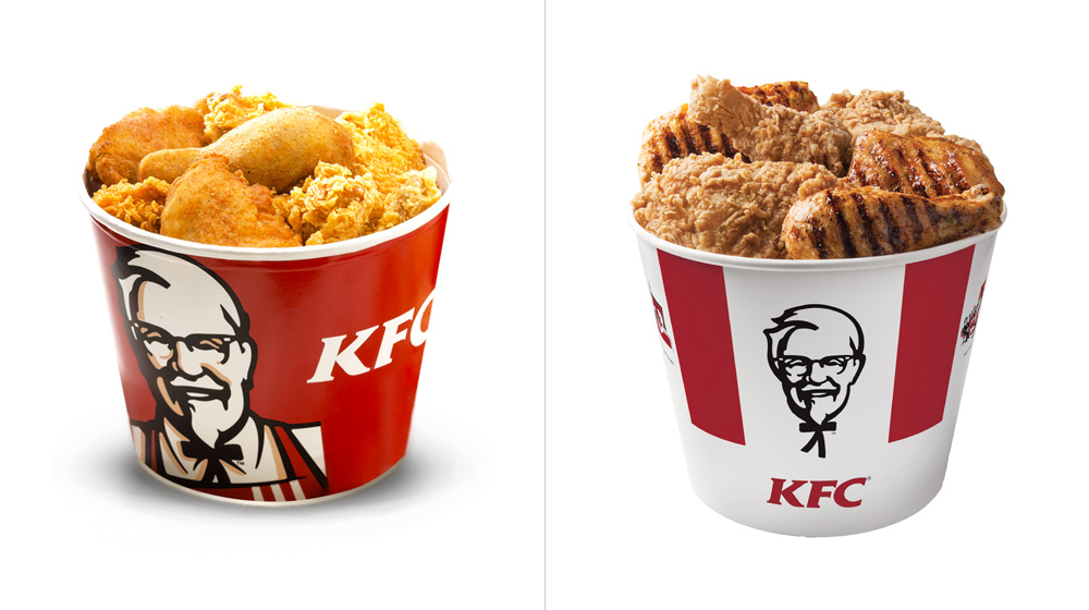 Sample of a before bucket (there are dozens of different ones so this is just an approximation) and the new one.
  The bars.
 The most significant aspect of this project and the one that undoubtedly stands out the most is the return of the ridiculously minimal red bars. It's almost baffling that such a simple and effective solution required decades to come back into style. If you search for "KFC bucket" on Google Images, the results can verge on the depressing with buckets filled with all kinds of graphics and swooshes and promotions and hash tags. Unfortunately, it won't be long before these minimal buckets suffer the same fate because money but, for the time being, we can relish in their simplicity.
Taking the graphic Colonel out of the tilted square graphic highlights the great drawing and placing it floating between the red bars frames it in a much more interesting way and is as close a modern replica as the original bucket picture a few scrolls above.
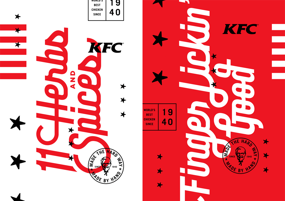

 Some typographic stylings. Not implemented but oozing with vintage grooviness.
 There are a few typographic directives established (or at least explored) by Grand Army that don't seem to have caught on with the Wieden + Kennedy campaign. But that's cool, we can still take a moment to appreciate them and wonder What if? In final execution, a condensed sans and some brush fonts have been put to use and it's quite decent.
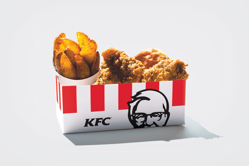
 Packaging as designed and proposed by Grand Army.
  Actual packaging in use.
  The new bucket with the new colonel.
 What's most impressive is that the original design has been carried throughout a dozen different boxes and buckets and cups. Sometimes what a design firm says is not necessarily what a major brand does. That inverted pyramid image are all screenshots of the KFC website taken this morning, so it's quite reassuring that KFC is embracing this minimalist approach. The KFC website is worth clicking through as they are doing a nice job of pushing the vintage graphics and ethos of the early days of KFC delivered in a contemporary way. Even the typography on the header of the website strikes that perfect balance between old and new. Overall, a great and cohesive effort on all fronts from packaging to advertising to digital presence that makes KFC feel more genuine and home-made than its fast food competitors. (I would still take a home-cooked meal any day of the week).
