Putting the MINI in Minimal

"Since its introduction in 1959, MINI has stood for intelligent design, iconic style and unparalleled motoring thrills. The original Mini was developed in response to a fuel shortage in the wake of the Suez Canal crisis. In 1957, Alec Issigonis, the top engineer of the Morris Company, was challenged to design and build a small, fuel-efficient car capable of carrying four adults, and what he built was a perfect balance of fuel efficiency, functionality and fun. It's from this heritage that the philosophy of MINImalism was inspired. MINImalism is a commitment to doing more with less, and these virtues were not lost on the endlessly inventive mind of racing pioneer John Cooper. He recognized the performance potential in the Mini's uncompromised simplicity and turned it into a world-champion rally car.
The current MINI family builds on the tradition of the classic Mini, adding state-of-the-art technology and modern levels of safety, quality and reliability. And now there is a MINI model to suit just about everyone. Drivers can choose from the iconic MINI Cooper Hardtop, the open-air motoring experience of the MINI Convertible, the versatile MINI Clubman, or the surprisingly roomy four-door MINI Countryman, available with all-wheel drive. And all are famous for their creative use of space and nimble go-kart handling."
Design by: KKLD (Berlin)
Opinion/Notes: A change for a brand like MINI would normally warrant a full on Review, probably on a Monday, but this change is so uneventful that there isn't really that much to talk about, in part because there isn't much to see. The logo is now minimal in a single color and it's… fine. It mostly reveals that, under the metallic shading and volume, there is a very basic, unexciting logo. The only other element to discuss is a new condensed serif corporate typeface that is also… fine. And I'm not sure it's the right choice for the MINI, which has always used a sans serif and makes for a better fit. If you look at the Clubman's microsite, it's like you are being sold two cars: a MINI and, say, a Jaguar. Overall… yeah, just fine. Too much press releasing for too little show.
Related Links: MINI press release
MINI Clubman microsite
Dezeen news story
Select Quote: A 2D logo in "Flat Design" was derived from the existing 3D logo, which provides high recognition: It imitates no material and no existing form, but stands on its own. The reduction stands out visually and allows use in all sizes and formats.
The new typeface MINI Serif reinforced the new brand image. It was developed from a Swiss designers crafted polished type that was used in the publishing industry, and then got a modern cut. MINI Serif reflects the high design orientation of the brand resist, underscores the high quality and gains by the contrast of tradition and modernity. The new MINI font is based on the viewer, it is easy to read and gives the contents of the space they need.
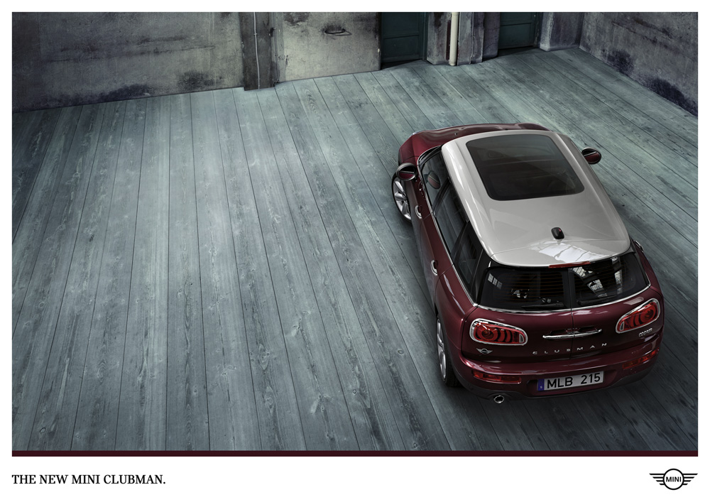 Clubman ad.
  "Catalog Black", the new custom serif.
Spot for the new Clubman.
"Catalog Black", the new custom serif.
Spot for the new Clubman. 