I Qan't Even


Established in 2006, Quantcast is a "digital advertising company specialized in audience measurement and real-time advertising" allowing marketers and advertisers to be highly targeted and specific in online advertising. Quantcast offers a free analytics service, Quantcast Measure, that is used by over 100 million websites (which gives them a lot of data for their own service) and has built 17 data centers to process up to 30 petabytes of data a day. Earlier this month, Quantcast introduced a new logo designed by New York, NY-based JaegerSloan.
The new brand mark is both a Q and a measuring tape, to pay homage to our focus on measuring and understanding the full scope of what we do online. It now also becomes a clearer representation of the window we provide onto commerce and culture, captured in a series of custom-made animated patterns, which will unveil themselves through the year.
Quantcast blog post
 Further logo explanation from their brand microsite.
  Wordmark detail.
 The previous logo was decent — very corporate — with one of the "a"s in the name replace by a "proportional to" (∝) symbol which made it a nerdy reference. Even if you didn't know what it meant (as was my case before I Googled it) it made the logo look like it was associated with formulas and maths. The new logo reflects Quantcast's growth into relationships with popular web destinations like BuzzFeed, Gawker, TMZ, and Yelp, so its identity has to be more accessible and more consumer-friendly even as a B2B service. The primary logo is the wordmark and it doesn't seem like it's meant to be regularly locked up with the Q monogram. On its own, it's a basic wordmark that is quite forgettable and has some dubious moves like the crossbar on the "t" being cut off on the first one but not the second one, the strange counterspace of the "q", and the extra slope-y "a"s. So I guess that's one too many grievances with it.
 Cars.
Cars.  Universe.
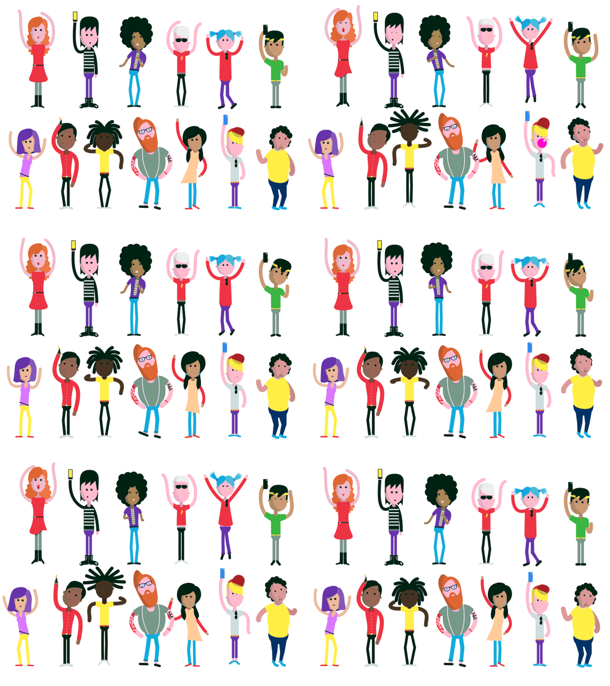
  Concert.
  The concert crowd by Al Boardman.
 The second part of the logo is the Q monogram and it's the more interesting element. It makes for a good social media icon and I like the idea that it's an analog measuring tape. The logo-as-window approach here is taken one step up by populating it with animated GIFs that are cool to look at even if sometimes the meaning isn't quite clear. Overall, a good move to make Quantcast a more recognizable brand and bring it forward from behind the scenes… and maybe they can analyze the small data in our comments to figure out that non-matching "t"s aren't cool.
