Eagle Trim

Established in 1996, Cebu Pacific is the largest carrier in the Philippines operating over 2,200 weekly flights to 34 domestic and 28 international destinations with a fleet of 55 aircraft. Earlier this month, Cebu Pacific introduced a new identity and livery designed by Singapore-based Bonsey Design.
The previous logo was fairly decent. Its only major misgiving was the execution of the eagle with the dark blue drop shadows below the dark green feathers — the eagle head itself was good. The old wordmark wasn't bad either; it was a rare case of a good sans serif with heavy contrast. The new logo goes for the über friendly approach by lowercasing the name and changing to a bulbous sans serif with half-curved corners. I have personally never liked this kind of sans but I can see its market appeal. That "f" though… not good. The new eagle icon is more airy, with the feathers separated from the head but in their effort to simplify the feathers they now look too stiff and a little awkward, almost like water droplets as if it were sweating. One nice thing about the overall logo change is that the new logo occupies the exact same footprint as the old, so applying the change is easier in terms of signage and other things that have a space already allotted for the logo.
 Business cards.
  Sample guideline pages.
  Livery, before and after.
  Process.

 Livery detail.
 The livery change follows the same pattern as the logo change, building on the established structure of the old system. The tail is still covered in yellow and features the icon but now it's better integrated and I like how the eagle head's feathers flow into the tail. The new wordmark I guess works better in a larger application. The only odd thing is the wavy yellow shape on the belly of the airplane, it's just too random.
 Ground transport livery.
  Ads, OLD.
  Ads, NEW.
 Although the ads are still an assault on your eyeballs and have that coupon-like vibe they are actually not bad (within that Let's Travel Places! aesthetic). I particularly like how they change the holding shape of the logo to match the stuff on the ad and, like everything else so far in the redesign, it's a straightforward evolution of what existed.
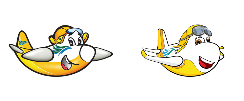 "Ceb", before and after.
 The mascot, cute. Also, kind of annoying. I'm guessing the majority of the traveling clientele for Cebu Pacific are adults so having a mascot makes little sense.
 Ad.
Cebu Air folks talk about the change.
Ad.
Cebu Air folks talk about the change. Overall, it's a safe evolution that is a full-on effort to make the airline more consumer friendly and bring into twenty-first-century aesthetics (which is not always forward-looking, innovative design — it's just a shinier, fresher coat of paint).
