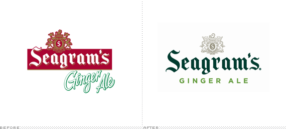
Originally owned by the now defunct Seagram Company Ltd, Seagram's is a line of mixers and the more well known ginger ales owned and distributed by the Coca-Cola Company, which acquired its rights in 2002. Seagram's Ginger Ale was a staple at the Brooklyn-based headquarters of UnderConsideration from 2007 to 2009 and since moving to Texas, where Seagram's is not available, we've had to settle for, like, water. Digression aside, Coca-Cola Company has been expanding Seagram's marketing and distribution in recent years and their latest move is a complete overhaul of the identity and packaging, designed by San Francisco, CA-based Hatch.
The Coca-Cola Company asked Hatch to help refresh the Seagram's mixers line and make it more relevant to the sophisticated adult consumer who is tired of overly sweet beverages. The decision was made to modernize the brand's crest and then use it in ways that announced that something new is going on. The crest is now more of a friendly element than a crown jewel, with visual treatments such as placing type over it and wrapping it around the corners of cases. And in order to help consumers shop amongst flavors, the cans are flooded with crisp, clean metallic versions of the colors consumers associate with the flavors category-wide.
— Provided Project Description


I had never paid much attention to Seagram's logo — what a mess. Semi-left aligned crest, on top of blackletter inside (yet slightly outside) a rectangle, on top of an angled script font with a stroke and shadow. Amazingly, the new logo retains the same elements but executes them all properly and brings them together cohesively. The blackletter is the focal point with the crest as a simple supporting element and the ever-trusty Gotham as the product descriptor. Center-aligned, thank you. The result is a vastly more contemporary and sophisticated logo. While the crest plays a supporting role in the logo, it becomes the centerpiece of the packaging, and it's a beautiful update of the previous crest, with clean straight lines and simplified forms — plus it's not colored red and gold like the old one, which is beyond useless.


The new packaging removes the explosive rendering of the drink in the background and replaces it with a blown-up version of the crest that serves as a backdrop for the typographic elements, creating a slick contemporary look that makes Seagram's feel more at place next to bottles of hard liquor at an adult party. The overall redesign is pretty fantastic, repositioning Seagram's as more than just another soft drink or mixer following the pack.

Don't forget to cast your vote about this post online
