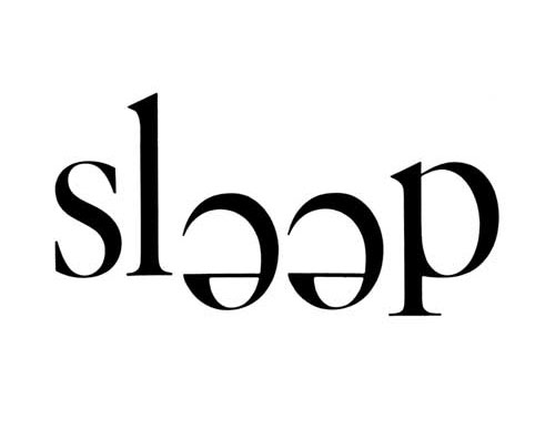
This week jkr kindly sent me a book. Looks good great. I’ll read it soon.
I can’t remember why I searched Twitter for ‘jkr’, but Jennie Spiller (a graphic designer at Turner Duckworth) appeared in the results. That, in turn, had me click on Jennie’s profile link pointing to The Disciples Of Design (TDOD), where I found this.

The TDOD post mentioned the 1962 experimental type booklet watching words move, by Ivan Chermayeff, Tom Geismar, and Robert Brownjohn. It was a new one for me (although probably not for you), so I Googled it, and found these spreads.


“First published in 1962, this work of experimental typography uses letters in a single typeface, Helvetica, to achieve surprising results — motion and narrative, emotion and humor.”
There are a few more images on Rebecca Woodcock’s blog.
Reminded me of this logo from my negative space collection.

Mouse, by johnson banks
But my point is…

Looks great, and goes to show, the definition of a word can be contained within the appearance of the word itself.
watching words move can be bought here:
on Amazon.com
on Amazon.co.uk
