Set to open in 2013, One World Trade Center (also known as 1WTC and previously Freedom Tower) is the flagship building of the thoroughly chronicled, scrutinized, and troubled development of the new World Trade Center complex, that includes four other skyscrapers, the National September 11 Memorial & Museum, 550,000 square feet of retail space, and a Performing Arts Center. One World Trade Center is the design of David M. Childs of Skidmore, Owings & Merrill, rising a symbolic 1,776 — the year of the United States independence — feet and boasting 2.6 million square feet of space to be filled by the likes of Condé Nast, one of the first big name tenants to sign a major lease. One World Trade Center is developed by the Port Authority of New York and New Jersey and developer The Durst Organization. Yesterday, the logo for the building was introduced, designed by London-based Wordsearch, a design firm specializing in branding and communications for real estate and architecture across the world.

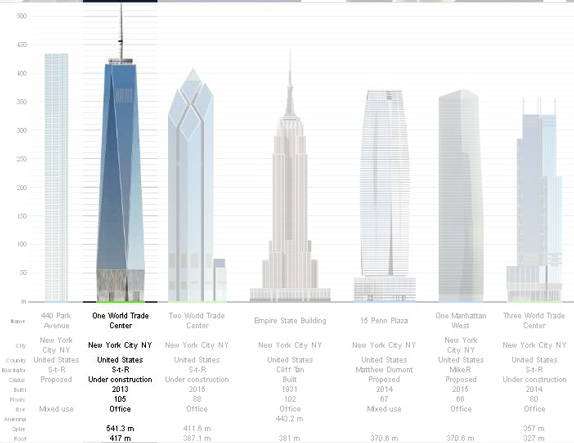
One World Trade Center height among other New York skyscrapers. Diagram from Skyscraper Page.
The mark suggests the summit and spire reaching into the sky above Lower Manhattan. By focusing on the very top of the building we reach out to the commonest experience of the building, as it will be seen from all around the city. As the tallest building in the Western hemisphere the building's ultimate height of 1,776 ft is a source of pride and inspiration, and is celebrated in the mark.
So, the logo achieves a number of goals. It is sufficiently visionary and ambitious to acknowledge the broader context and wider significance of this building, while remaining appropriately bold, confi dent and business-like to reflect One World Trade Center's true, central purpose as the world's latest, greatest piece of commercial real estate.
— Provided Press Materials


Tagline.
I don't envy the job of Wordsearch, mostly because designing logos for landmark buildings invariably leads to some kind of graphic abstraction of the whole building or a detail of it and they rarely look as good on paper as they sound when pitching it or explaining it. This is no different. The idea is great and heroic: showcasing the pinnacle of the tallest building in the Western Hemisphere! And while the pinnacle looks to be stunning in the renderings amidst the skyline of New York and against lusciously photographed skies the effect is completely lost when placed inside a circle. The sharpness of the spire itself is lost when translated to a logo as it needs to be bulked up to not get lost at small sizes and avoid getting it filled in with the color and gradients around it. The choice of Gotham is painfully obvious and in choosing a typeface that is meant to evoke the "street-level" business aura of a bygone New York the effect cheapens what is otherwise an expensive and sophisticated address to lease office space from. In less words, I think this logo misses the mark, I feel there is a big disconnect between the building itself and the tenants it hopes to attract.

Don't forget to cast your vote about this post online
