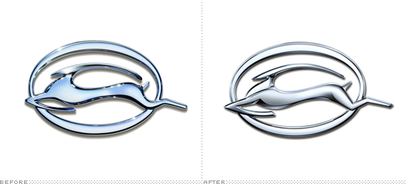
First produced in 1958, the Impala is one of the most popular — and unpopular — brands from Chevrolet. Once one of the great-selling cars in the 1960s and ’80s its design in the ’90s and early ’00s has left much to be desired for, having gone from elegant and muscular to a flat, long, and depressed look to a generic, rental-looking car. Popular with police departments though. At the New York auto show this week, Chevrolet introduced the much nicer 2014 Impala and revised its badge, which has shown a stylized impala (an African antelope) since the ’60s. The newest version was designed by Joann Kallio, who, as master car writer Phil Patton reports, "has been a graphic designer at G.M. for more than 25 years and is the lead creative designer on Chevrolet global badging." Global badging, now there is a department I didn't know existed.
"He wanted the emblem to be elegant, muscular and have crispness," Ms. Kallio said. "We kept the stylized, rather than literal, interpretation of the animal, and made the Impala more muscular." She said the musculature was most evident in the shoulder and lower body, as well as in the front leg and rear knee.
The design began with a flat outline, which defined the angles of the badge. Working in the design application Alias, Richard Stafford, a sculptor, produced the digital model. It was rendered by stereolithography into a physical model, which was then chrome-plated to demonstrate how the light would play on it — a critical factor, Ms. Kallio said.
Finally, the team had the logo milled out of aluminum and polished.
— A Mammal's Evolution, Documented in Chrome on the New York Times
If you are into cars, this shows the new Impala. No logo animation, just some Terminator 2-esque morphs at the start.

Patton compares Chevy's Impala badge to Ford's Mustang and Jaguar's leapers and growlers badges — not being a car person myself I wouldn't put Impala on the same category as the latter two, which can be easily recognized and, more importantly, aspired to by a larger slice of the population. Whereas the Mustang is clearly a horse and the Jaguar a jaguar, Impala is a less clear and less popular antelope, not an animal Americans put much thought into I would wager. But I digress on the merits of 50 years of Impala badges and the animal they chose to be represented by. The new logo is only an evolution but a very successful one within the parameters it has to work in — it's a badge, so it has to reproduce on metal and it has to look shiny. The impala looks more slender and energetic with firmer butt, sharper knees, chiseled chest and neck, and more dynamic mid-run pose. Even the counterspaces within the ugly thick-and-thin oval look better resolved. Overall, it's not stop-the-press logo redesign but always nice to see well thought out mini evolutions.
Thanks to Patrick Kernan for the tip.

Don't forget to cast your vote about this post online
