RIP goes the Dinosaur

Established in 1995 as an expansion team, the Toronto Raptors are the only Canadian professional basketball team in the NBA, playing in the Eastern Conference. The Raptors' best years came during the late 1990s and early 2000s when Vince Carter was their star player. After plenty of dubious seasons, the team is back at the top of its division with a current 25-12 record. This past December, the Raptors announced a new logo that they will begin using in the 2015 – 16 season, designed by local firm Sid Lee, who were also responsible for the "We The North" campaign launched during last season's playoffs.
We The North campaign and new logo introduction.Last April, the Toronto Raptors marked a new era, and attitude, in the team's history with the launch of the "We The North" campaign. Today the team took the next step in redefining the Raptors' identity with the launch of its new primary logo, a circular shield with a ball torn by the unmistakable attack of a Raptor.
Launched with a video for fans that proclaims "We The North is our battle cry and this is our shield", the new logo will be introduced in time for the 2015-16 NBA season.
Raptors press release
Although the Raptors' primary logo is the raptor dribbling a basketball, almost anywhere you look it's the alternate ball-and-claw logo (shown directly above) that is being used the most. It's no surprise. In part because it's a much simpler and efficient icon and in part because a dinosaur in a jersey and shorts dribbling a basketball is stupid. I bet it's sold great as merchandise but, really, look at it. Nothing says fierce like a steroid-pumped dinosaur with shoes that have holes for its claws. Point being: moving away from that logo is a good thing, and creating something that ties in with the more aggressive and street-wise We The North campaign is a smart approach.
From the reactions I've read online, the logo hasn't been too well received and the main complaint is that it looks too much like the Brooklyn Nets' logo, because it has a basketball with type in a circle around it. My disdain for the Nets logo is well documented, so no point in rehashing old stuff. What I will say is that the Raptors logo is far better than the Nets. Mostly because there is at least an idea behind it. And it's a good one, building on the legacy of the team's logo over the years and its name. There is no need to show you a dinosaur. We've seen the dinosaur handle that ball for years. Now we only see the effect a dinosaur would have on a basketball. It would rip it. I think it's a great logo that works perfectly with the name and is an even better evolution of the existing alternate logo, removing the actual claws that you still "see" implied in the new one. We don't need to see a raptor either, we can imagine it — thanks mostly to Jurassic Park. While the execution is a little simplistic — those torn edges could be more convincing — the approach is very right. The typography around the ball is a welcome change from overwrought and spiked sports typography.
 Early merchandise.
 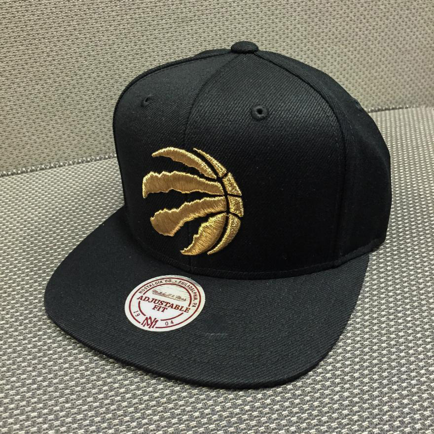 Hat.
Hat.  T-shirt. Shiny.
 From what little there is in terms of application — basically the promotional merchandise above — the Raptors are leaning towards a black and gold color palette, aiming for a more sophisticated-slash-edgy crowd than the kid-friendly dinosaur of yore. This is thanks in part to rapper Drake, who became the Raptor's global ambassador in 2013, helping boost team spirit in a time of need. He's been so involved with the team that he even boasted about the upcoming redesign… only to later be upset about it! (That link is a pretty good story and worth a read). Anyway, in terms of adult-ing the Raptors brand and evolving into something more interesting, I think this direction is not a 360-two-handed slam dunk, just a nice one-handed, straight-up dunk in traffic.
