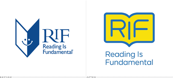
Established in 1966, Reading is Fundamental (RIF) is a nonprofit literacy organization whose main mission is "to motivate young children to read by working with children, their parents, and community members to make reading a fun and beneficial part of everyday life." In its 44-year history RIF has distributed more than 380 million free, new books to more than 33 million children and counts with 400,000 volunteers nationwide but without a prominent and relevant brand campaign since the 1980s, RIF has lost awareness in the eyes of the public. Working with Mother New York, RIF has introduced a new identity, with the logo having been rolled out in November of last year and a more comprehensive brand being rolled out now.
The new logo is a modern formation of an open book--its openness symbolizes a voice for underserved communities and the world of possibilities opened to children through reading. The new mark is further enhanced by vivid tones of yellow and blue, creating a symbol that is electric and boldly stands as a badge of honor for all people that believe in the power of reading. RIF's reenergized image is just the first step in many planned for their anniversary year to help book people across the nation unite.
— RIF Press Release

Logos with illustrations by Mark Giglio, Todd St. John, Elena Xausa, Steven Harrington and Dan Stiles.


Everyone has a voice but not everyone is truly heard. And much like the way books are a voice for authors, RIF is a voice for underserved communities. […] The RIF logo is a graphic representation of this voice. It is an open book full of possibilities as well as an endearing form that is approachable and longs to speak and interact. It's a flexible identity that can be customized to a range of readers from children and parents to government officials and corporate partners.
— Mother New York Provided Case Study


It's hard to dislike the previous logo — I mean, who can be angry at an emphatically smiling, open book? But, let's face it, the icon isn't the best thing since moveable type. The book itself is exaggeratedly pointy, the eyes are too close together, and the smile is the size of Julia Roberts' mouth. And the typography is a total disconnect, both by itself in its combination of serif and sans serif and against the icon. The new logo solves some of the formal problems of the old one, with a cohesive visual language of roundedness. It also manages to work conceptually on two levels: first, as a book with the "I" serving as the gutter and, second, as a speech bubble that isn't the usual cliché. What it lacks, of course, is the happy innocence of the old logo, there is no charming book smiling at you, patiently waiting for you to smile back. Mother New York has solved this by letting its logo serve as, literally, an open book where great characters spring from and they can be cute, fantastical, or anything the invited artists want it to be. This is where this identity succeeds and has the potential for great partnerships and extensions — once you establish that anything can come out of the book, the options are endless.
The rest of the identity still reflects that it's in the prototype stage, with some interesting applications — I would love to see more of the multi-line typeface in use — and ideas that, again, demonstrate great potential in turning this into a memorable brand campaign for RIF.


Don't forget to cast your vote about this post online
