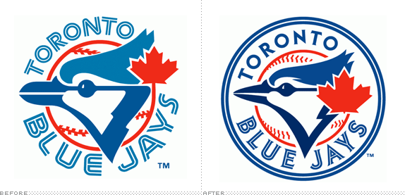
The Toronto Blue Jays joined the Eastern Division of Major League Baseball in 1977 and are two-time World Series winners (1992 and 1993). With the departure of the Montreal Expos to Washington, the Blue Jays are the sole Canadian team in the MLB. Last week, the Blue Jays announced new uniforms and a new logo for the 2012 season, designed by the MLB's Design Services, that take them back to their original look

The new look is a modernized version of the franchise's first logo that was used from 1977-97. It features a sleeker-looking Blue Jay bird head with a prominent red maple leaf to showcase Toronto's standing as the only Major League Baseball team in Canada.
The new look was more than 18 months in the making. It was created by the Blue Jays with assistance from the Design Services division of Major League Baseball, in conjunction with members of Toronto's staff, manager John Farrell and several players.
— Press Release
Promo video for new logo. Cold, hard proof that it embroiders!

Alternate logo, above. Lettering options, below.


The previous logo stood out from the rest of MLB's logos in that it used the super angry, super italicized, super stroked look that clashed against the simplicity of most other team logos. So it's nice to see a storied franchise go back to their roots and revive a well-known logo. Unfortunately the original logo wasn't that good so the revival can only do so much. The logo looks like a plate of food served haphazardly, one thing on top of the other, with the maple leaf as garnish. The execution is better — from the blue jay itself to the chiseled serif type choice to the inline lettering — but the arrangement mostly remains awkward. Not terrible, just not great. The alternate logos and lettering options, on their own, look quite disconnected even if, again, they are sort of well done. There just seems to be a lack of cohesiveness and connection between icon and typography. Nonetheless, a welcome change to simpler things.
Thanks to Chris Rooney for first tip.

Don't forget to cast your vote about this post online
