Spaceball

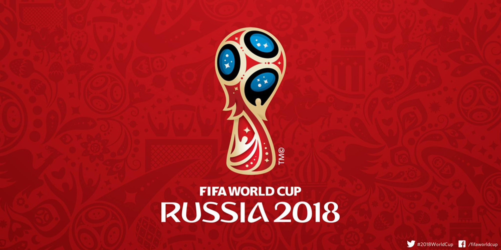
Set to be held in Russia (for the first time in history), across eleven cities during June and July, the 2018 FIFA World Cup needs no further introduction given that everyone became a World Cup fan this year. This week, FIFA introduced the official emblem through a countdown from Russia's International Space Station and a projection mapping show on the Bolshoi Theatre in Moscow. The logo has been designed by Lisbon-based Brandia Central.
To creatively capture the essence of this remarkable, historic moment, inspiration was drawn from both Russia's rich artistic tradition and its history of bold achievement and innovation. Above all, Russia's pioneering in space was a truly captivating theme.
The shape of the Official Emblem of Russia 2018 takes on the universally recognisable outline of the World Cup Trophy, while the bold use of red, gold, black and blue in the emblem's colour palette was inspired by centuries-old techniques seen in world-renowned Russian art dating back to the earliest icon paintings.
The magic ball at the top of the emblem puts the world's love of football into the spotlight. And the components of the emblem taken together blend unique attributes of the World Cup and of Russia as host nation. It unites magic and dreams, as the competition will do for millions of fans in 2018.
FIFA press release
To state that I hated the 2014 World Cup logo would be an understatement. It was awful. Every time it appeared on screen it made me cringe more than a Brazilian seeing 7 goals go through their net. In the same game. So an ambitious new logo for Russia is a very welcome feeling. A visual blend of Fabergé egg, the Red Square's Saint Basil's Cathedral, Sputnik, and other cues, the trophy-shaped logo has an unapologetic decorative flair that is evocative, appropriate, and, against all odds, oddly attractive.
The "RUSSIA 2018" typography… I want to not like it, yet I do. And plenty. It's very unique, possibly in the wrong ways, but it has a very interesting thick-and-thin rhythm that complements the curves of the emblem really well.
Apart from our own preconceptions, we dug really deep into Russia's identity. All of the research corroborated the idea that Russia is the land of Magic. A centuries-old culture, a fairytale-like architecture, the soul of its people, known by its determination and by the achievements that follow. Visually, we can find several inspirations from this background. Generally speaking, there is a sense of elevation, of ascending, like a spacecraft. This rising movement is reinforced by the human elements of the symbol, also inspired by the mankind's ambition to reach for the stars, as well of the desire that every football player has of raising the World Cup trophy. The top element reminds us of a football ball together with the Sputnik's shape. A special ball that will spread its magic throughout the biggest country on Earth, inviting all the people to join the celebration. As you can see, Russia's Space adventures and achievements were a true theme. The colours red, gold, black and blue reflect the centuries-old techniques seen in world-renowned Russian art dating back to the earliest icon paintings. This brand celebrates the magic of Russia and the dreams of the whole world.
Design Week interview with Miguel Viana, chief creative officer of Brandia Central
 Pattern graphic.
Summary of the emblem launch on Earth and Space. (Full coverage here)
Projection mapping on the Bolshoi Theatre in Moscow. Best part is at the 1:02 mark when the pattern becomes visible.
Pattern graphic.
Summary of the emblem launch on Earth and Space. (Full coverage here)
Projection mapping on the Bolshoi Theatre in Moscow. Best part is at the 1:02 mark when the pattern becomes visible. Not much to see in application yet — and what little we do have to see has the screen resolution of dog food — but the pattern looks extremely promising, filled with Russian mythology, architecture, and motifs. What I appreciate the most about this project is that it's a reflection of Brandia Central's style and approach, which they have been doing for many years for smaller basketball tournaments and soccer competitions, that will now be displayed in one of the world's biggest stages. As a fan of their illustrative work, it's fun to see them get a big project like this. To conclude more on point: This new emblem is not perfect, it's already being compared to a Powerpuff girl and American Dad's Roger the Alien, but looking at the four World Cup logos of the twenty-first century this is, by far, the best and most valid.
