On Cue

Booze Week continues on Brand New! First produced in 1865 by Juan Serrallés in Puerto Rico, Don Q— as the brand was named in the early 1930s (after Don Quixote) — is the top-selling rum in Puerto Rico, where, also, 70% of the rum consumed in the U.S. is produced. Owned by Destilería Serrallés, Don Q has been available in the U.S. since 2009 when the distillery opened an outpost in Dallas, TX, importing the different rums available: Cristal, Gold, Añejo, Gran Añejo, and four flavored rums. This month, Don Q introduced a new logo and packaging designed by Dallas-based TracyLocke.
With its 150th Anniversary approaching, Destilería Serrallés, has refreshed its flagship brand, Don Q with a brand new look to its packaging, paying homage to its heritage with a retro look filled with character and inspiration. Drawing on its 149 years of history, the look and feel of the new package features clean classic lines and elegant graphics that go in line with the values that have guided the Serrallés family rum-making tradition for six generations.
Press release
The previous logo had a literal depiction of Don Quixote, looking a little sad, sitting on top of a relatively decent wordmark that felt more like a corporate wordmark than a party-starting alcoholic drink. Giving the boot to Mr. Quixote, the new logo focuses on the "Q" and grows a leafy, floral crest around it. It's a little bit random but it's kind of pretty and well done, with the thickness of "DON" matching that of the crest and bigger flowers while the "Q" sits comfortably in the wider bottom. More importantly, the logo fits on the bottle much better. (And look! Sad Quixote is on the new neck foil.)
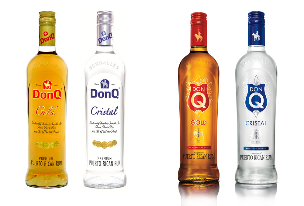 Before and after comparison of two of the main rums.
 The new bottles are a vast improvement over the old ones. The logo takes up a nice chunk of real estate, giving it excellent shelf presence and its leaves and flowers integrate very well with the product. The rest of the typography moving down from the logo starts out okay with the stroked sans but then gets less exciting with the cheesy script and condensed serif at the very bottom.
 Full line-up.
  Bottles with sexy backgrounds. The pattern is quite nice.
  Bottles at sexy angles.
  Flavor rums with sexy splashes of color.
 The flavor bottles are a good extension of the new look, with the logo taking a smaller role to let the bold flavor names be more visible. Set in a decent script with a dash of watercolor behind it, the design stands out attractively against the frosted bottles.
Unlike yesterday's Glenfiddich, this isn't a premium — "premiumimisetized", using their parlance — liquor product but with this new design, Don Q definitely feels more upscale and refined — the only major misstep of this redesign is Don Q's website, which is drenched in cheap-looking gold gradients and far too much Century Gothic.


